Reflection following Exercise 4.5

Not so much a learning process, as a re-examination of things I already believed.

The verticals don’t have to be vertical. The subject doesn’t have to be in focus, or even the main focal point of the image. You don’t have to fit everything in… often, it’s better if you don’t.  The subject/object can be viewed in a non-typical context. It doesn’t have to be pretty. Details matter… or don’t… and imperfections can be perfect.

Sometimes it’s as much about what it feels like as what it looks like.

Looks horrible, but you still like it? Sounds good to me.

Exercise 4.5 – Chairs

A quick google search of ‘chairs’ produced mostly sales photos with plain backgrounds. This one was at least pleasing to look at.

808.089_axy1h9ux.6

Figure 1. Cotswold Country Interiors (2017)

My own images are somewhat different, and contrary to what the coursework asks for, I can’t narrow my selection down to one image.

Rather than be influenced by the works and styles of other photographers, given that this exercise is intended to demonstrate creativity, I’ve chosen to demonstrate my creativity.

These images represent the world I live in (literally), and the way I see it. They aren’t staged. What I’ve not done is try to make things look pretty. There is chaos, and abandonment and decay. I love these things, and see beauty  in them.

Chairs1a_800

View 1000 x 1500


Chairs10a_800

View 1000 x 1500


… stepping away from that particular reality


Chairs4_800

View 1000 x 1500


Chairs5_800

View 1000 x 1500


Lets move indoors…


Chairs12_800

View 1000 x 1500


Chairs14_800

View 1000 x 1500


Chairs15_800

View 1000 x 1500


Reference 

Figure 1. Cotswold Country Interiors. (2017) Chairs [Advertisement] AT http://www.cotswoldco.com/dining-room-furniture/dining-chairs/light-oak-grey-linen-dining-chair/?gclid=Cj0KEQjw5YfHBRDzjNnioYq3_swBEiQArj4pdGsLBmcRKMJLcwbV_uuSxEd1p3IRa4u9zo0NI3hXdm8aAsgz8P8HAQ (Accessed 03/04/2017)


Reflection following Exercise 4.4

I have no special studio equipment or lights, and so was using what I had to hand. (I have ordered some cheap gear from a chinese company who I do a little promotional work for, but it hasn’t arrived yet). As such, my light sources were weak and unable to cast significant light from any distance. This being the case, I was unable to see the effect, on shadows, of moving the lamps further away.

Nevertheless, I was able to see how the positioning and use of multiple light sources has a dramatic effect on the look of an object.

I have concluded that a light source directly in front of the object doesn’t look good at all, while having the light from one side balance out the light from the opposite side doesn’t look much better.

Two light sources, one stronger than the other, from different angles, seems to produce the most interesting images. In this way, it’s possible to create a sense of balanced depth. There are shadows, but they aren’t overstated.

My attempt to alter the colour of the light was largely ineffectual, but it did alter the atmosphere very slightly.  I’m sure proper colour gels on proper studio lighting could be very useful.

Exercise 4.4 – Studio Lighting

Examining the effects of controlled lighting.

There were two or three light sources in these images.

1: A Window on the right, about 10 feet away, with curtains either open or closed.

2: A small directional halogen lamp.

3: A battery powered bulb producing weak, non-directional, light.

Image 1

This image was taken as a reference shot, using just ambient light coming in through the window on the right. It’s blurred as I pressed the shutter manually and jogged the camera slightly. Doh!

The image is dull and unexceptional.
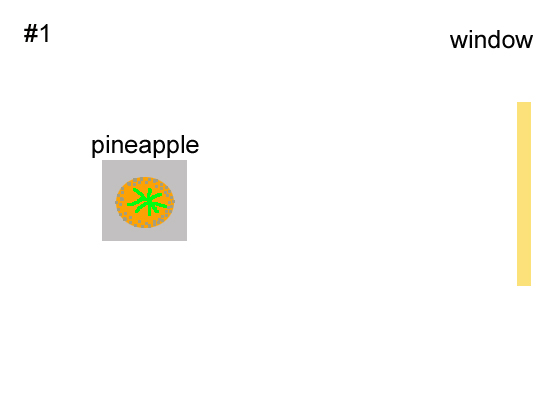
Exercise4_4_Studio_0_800

Lighting_1

Image 2

Shot with light coming from the window on the right, and a small halogen lamp just out of shot, to the left.

The light from the lamp on the left combined with the ambient light coming from the right produces quite a flat looking image.
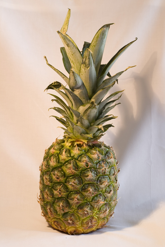
Exercise4_4_Studio_1_800

Lighting_2

Image 3

Shot with ambient light from the window on the right, and a small halogen lamp pointing directly towards the pineapple, from the front.

The resulting image looks quite wrong, to my eyes. The lamp is set quite low, and to my mind, the pineapple just needs a set of fangs and a cape to complete the effect.

Exercise4_4_Studio_2_800

Lighting_3

Image 4

Shot with ambient light from the window on the right, and a small halogen lamp just out of shot, to the right of the pineapple.

Strong shadows on the left of the pineapple.  High contrast. Not displeasing, but a little overstated.
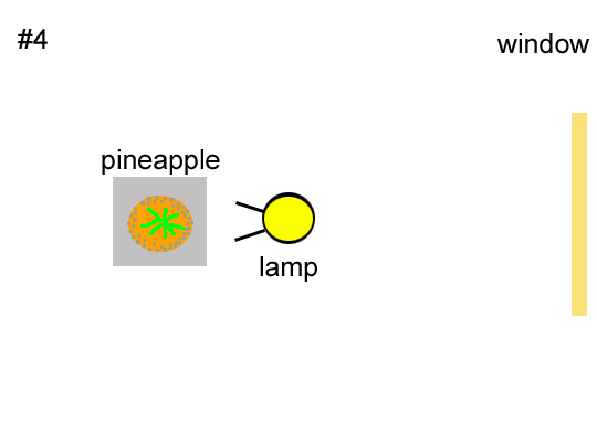
Exercise4_4_Studio_3_800

Lighting_4

Image 5

As the previous shot, but with the addition of a small battery powered bulb, in front and to the left of the pineapple.

I like this. There aren’t particularly strong shadows, but it isn’t flat and lifeless either.
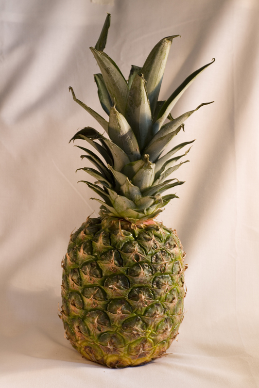
Exercise4_4_Studio_4_800

Lighting_5

Image 6

As the previous image, but with a green carrier bag over the halogen lamp.

Apart from making the shot slightly darker, the green bag didn’t have much effect on the pineapple. The tone of the background is slightly altered though. It looks like a nice warm evening. (It was around 10am).
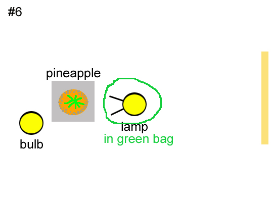
Exercise4_4_Studio_5_800

Lighting_6

Image 7

The curtains are now closed. There is a small halogen lamp covered with a green carrier bag just to the right of the pineapple.

As with the shot where the curtains were open (#4), this is a high contrast image with strong shadows. It seems slightly sharper, but not greatly different.

Exercise4_4_Studio_6_800

Lighting_7

Image 8

The curtains are closed. The lamp with green bag are behind and to the right, while the battery powered bulb is behind and to the left.

I find this a very interesting image. With light to the rear, and the front of the pineapple in shadow, there’s a real feeling of depth.

Exercise4_4_Studio_7_800

Lighting_8

Image 9

The curtains are open. The lamp in a green bag is to the right and slightly behind, while the bulb is to the right and slightly in front of the pineapple.

High contrast, with strong shadows.

Exercise4_4_Studio_8_800

Lighting_9

Image 10

The curtains are open. The lamp in green bag is to the right and slightly behind the pineapple. The bulb is to the left and slightly behind the pineapple.  The shot was deliberately overexposed and then contrast and vibrance were boosted in post.

I was just messing around to see if I could achieve a ‘high key’ effect.  I may have overdone it.

Exercise4_4_Studio_9_800

Lighting_10

Reflection following Exercise 4.3

Compared with Exercise 4.2, I found working with artificial light more predictable and enjoyable. While it can be limiting, in terms of subject matter…. you can’t go and shoot landscapes in artificial light…  I like the predictability (and sometimes, controllability).

While it would have been nice to go out and shoot dramatic atmospheric images like Dan Holdsworth, the necessary atmospheric conditions just weren’t there, so I found myself interested in much smaller details and subjects.

Multiple light sources of different qualities make for very interesting images, though I also found these the hardest to shoot, while for reasons that I don’t understand, highly coloured light causes some software problems.

While the subject matter and general feel of these images is varied, I do find there’s one thing that’s common to all of them. They have a sense of stillness. In some it might be odd, with a certain tension… but all are calm and quiet. I like that a lot.

Exercise 4.3 – The Beauty of Artificial Light

Sometimes I find myself stumped as to what to take photos of, when it comes to exercises and assignments. For this one, I found myself spoilt for choice… and I didn’t have to travel far.

Image 1

Exercise4_3_ArtificialLight1_800

View 1500 x 1000

4_3_1_EXIF

Fake sunflowers and a clutter of personal hygiene and health products.

The window in the en suite. The only available light is from the street light outside, filtered through patterned glass.


Image 2

Exercise4_3_ArtificialLight2_800

View 1500 x 1000

4_3_2_EXIF

Fence, bushes, abandoned chairs, and an LED lamp that’s imitating a candle.

There are multiple light sources here, from a neighbour’s garden light, the light in my kitchen, and dimmest of all, though the only one seen directly, the LED lamp.

I took a similar shot of this scene, with the lamp in focus, but I find this one, when viewed as a larger image, has more points of interest, in the fence and details on the abandoned chairs.


Image 3

Exercise4_3_ArtificialLight3_800

View 1500 x 1000

4_3_3_EXIF

Phone, router and plugs, in a cubby in the kitchen.

The LEDs are not especially bright, but in a confined space and with a long exposure, they create an interesting atmosphere. If it were red, I’d call it a warm glow, but in green, it’s kind of alien.


Image 4

Exercise4_3_ArtificialLight5_800

View 1500 x 1000

4_3_4_EXIF

Fairylights in the kitchen.

This was a difficult image to render. For some reason, loading the RAW image into Photoshop’s ‘Camera Raw’ feature produced an oversaturated mass of blue, with a huge loss of detail, that looked nothing like the camera had shown in it’s display. I had to use Canon’s Digital Photo Professional to render the image.


Image 5

Exercise4_3_ArtificialLight6_800

View 1500 x 1000

4_3_5_EXIF

An untidy garage at night.

There are multiple light sources here. A battery powered bulb in the garage, street lights out of shot, and a garden light illuminating the garage door in the other side of the street. These multiple sources make an interesting and varied image.

This was the only image that required multiple shots, with various apertures and exposures, before I could get things looking the way I wanted.


Image 6

Exercise4_3_ArtificialLight7_800

View 1500 x 1000

4_3_6_EXIF

In the fridge.

A single, dim light source with a grille across it, in a confined space, with beads of water and white surroundings. What’s not to like?

Reflection following Exercise 4.2

Clearly, the time of day can have a dramatic effect of the look of a photograph. The mood and atmosphere of essentially identical shots can be significantly different, entirely due to the quality of the light.

What I am learning, not so much from this exercise, but from broader studies, is that what makes a ‘nice’ or even ‘beautiful’ photograph, often is the exact opposite of what is regarded as the norm, or desirable, in contemporary art photography.

The current trend is to seek a flat tone, so that the objects within the image are the important factor. Context and meaning… not mood, seem to be the order of the day.

I’m actually finding myself somewhat troubled by this, as in the context of this module, I’m unsure if I’m supposed to be demonstrating technical skills while working with different qualities of light, or creating art, which seems to shun those very skills.

Indeed, it seems that much of what is considered desirable in modern art photography runs counter to the skills being taught in this module. Obviously, it’s better to have the skills and then not use them, than not have them, and find you need them. I do, though, wonder what we are marked on when it comes to assessment. Art, or technical skill? (Assuming I’m capable of either, as I find I’m having a crisis of confidence right now).

Exercise 4.2

13/03/2017 07:41

07_41

The sun is up, bright and clear, but still low in the sky. It casts long sharp shadows, causing much of this scene to still be in the shade from the garden fence and trees. In a more open setting, this would create some striking images.


13/03.2017 10:06

10_06

With the sun higher in the sky, the sharp contrast between light and shade is clear. It’s a very white light, but with the high contrast, it could make complex scenes difficult to pick out. This could be used to advantage if a striking image was wanted.


13/03/2017 11:13

11_13

With the sun higher in the sky, and just a little cloud, the light has evened out, making for a much smoother image. This would be a more useful type of light if an objective image was required, where the subject, rather than the mood, was what was important.


13/03/2017 12:10

12_10

Even at midday, at this time of year, the sun never gets completely overhead. There is some warmth to the quality of the light, and shadows are still cast.


13/03/2017 15:15

15_15

The shadows are getting longer again, and there is a warm golden quality to the light, made all the more striking by the dark clouds in the background.  (This was actually a fleeting moment. My neighbours probably thought I was mad as I rushed out with my camera every time there was a flicker of sunshine)


13/03/2017 15:58

15_58

The warmth and atmosphere of this golden light is so thick you could scoop it up with a spoon and pour it onto ice cream. Great for mood, not so good for objectivity.


13/03/2017 16:59

16_59

And that’s it. We’ve lost the direct sunlight, and while we still have daylight, everything is flat and dull.


13/03/2017 17:56

17_56

Even flatter. Probably usable for surreal images, but not much scope for any other form of creativity.

Exercise 4.1

4.1 – 1

With the camera in Aperture Priority.

Black

Black

BlackHistogram


Grey

Grey

GreyHistogram


White

White

WhiteHistogram

You don’t even need to look at the histograms to see that in an auto mode, the camera has averaged the brightness of each image, so that regardless of whether the subject was black, white or grey, they all look pretty much the same.


4.1 – 2

Now with the camera set on manual.

Black

BlackManual

BlackManualHistogram


Grey

GreyManual

GreyManualHistogram


White

WhiteManual

WhiteManualHistogram

With the camera set to manual, and exposure adjusted via shutter speed, aperture or ISO settings, the subjects can be made to look the shade you would expect them to be, which is reflected in the histograms.