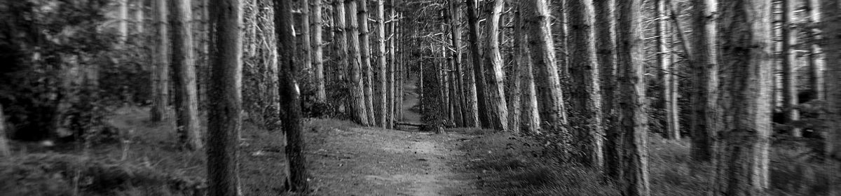
‘Use your camera as a measuring device. This doesn’t refer to the distance scale on
the focus ring(!). Rather, find a subject that you have an empathy with and take a
sequence of shots to ‘explore the distance between you’. Add the sequence to your
learning log, indicating which is your ‘select’ – your best shot.
When you review the set to decide upon a ‘select’, don’t evaluate the shots just
according to the idea you had when you took the photographs; instead evaluate
it by what you discover within the frame (you’ve already done this in Exercise 1.4).
In other words, be open to the unexpected. In conversation with the author, the
photographer Alexia Clorinda expressed this idea in the following way:
‘Look critically at the work you did by including what you didn’t
mean to do. Include the mistake, or your unconscious, or whatever
you want to call it, and analyse it not from the point of view of your
intention, but because it is there.’
Sometimes I find myself frustrated by the exercises in this course, or rather, by the way they are explained… or in fact, not explained. This is one of those cases.
When I read this exercise, my brain just goes “wtf?” I know an aspect of this course is based on not thinking literally, and in interpreting the instructions, but sometimes it just seems like gibberish.
I’ve looked at the work of a few other students, and how they’ve interpreted this exercise, and I find I must be reading it differently.
I think part of what I am struggling with is ‘find a subject that you have an empathy with’ . As a statement, this has no meaning to me…. at all. It’s like trying to explain a colour to someone who was born blind.
As I’ve mentioned previously (and I do try not to labour the point, as it’s not something that defines me as a person) I have a mild form of Asperger’s Syndrome. One aspect of this is a lack of empathy. I can rationalise… try to work out what a person might be thinking in a given situation… but on an instinctive level, I am oblivious to how someone else is feeling at a given time, unless it is overtly written all over their face (by which time I’m probably in trouble) , or if they come right out and say it. (I’m so thankful that my wife understands/accepts this.)
An aspect of this inability to empathise is a sense of isolation. I feel very apart from ‘people’. I like socialising (sometimes), but always feel like a tolerated outsider.
Add to this, fairly ruined eyesight (following vitreous detachments in both eyes, requiring laser surgery to repair a retinal tear in my right eye)… severe tinnitus, and an almost complete loss of smell and taste following a virus… the way I find myself experiencing the world is somewhat detached, to say the least.
So it is from this perspective that I’m approaching the exercise. I needed to find something to represent this sense of detachment and isolation. Something broken.
(This all sounds quite sad, as I read it. I’m not sad, or wanting sympathy. I just experience the world differently.)
A search of the local area on google Earth reminded me of something I spotted a year or so ago in Creswell, by chance, while researching for an Open University design course. Something sitting alone in a field… something broken… something forgotten. Try finding this object on google and you’ll have a very hard time. I found only one brief mention of it, and in that, the admission that nothing was known of it.
It looks like a chapel, but it’s described in that one online mention as a waterhouse. The water running to and from it is no doubt a factor in that.
Anyway…
Image #1
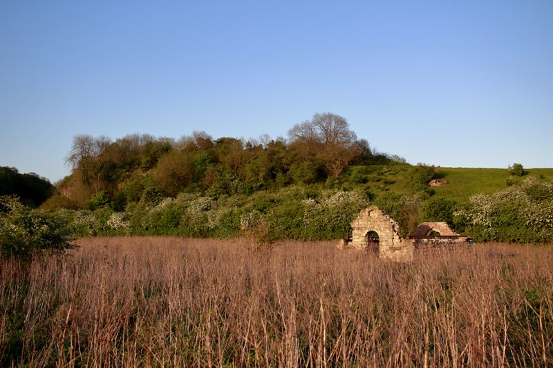
The main object… the subject… is the abandoned building sitting in an overgrown and untended field. It’s overlooked by a partly wooded hill.
The overall image, when not looking at the details is split into three horizontal bands of colour, gold, green and blue.
I like how the base of the (missing) roof fits exactly level with the border between the green and gold coloured bands. This was unintentional, and at the time, unnoticed.
The tidy(ish) lines of the composition are broken up on the left by the presence of a bush, in the field.
Overall, this is a fairly unspectacular image, but it’s purpose is to set the scene. Here is a building in the middle of nowhere. It’s not easy to get to. It’s purpose appears as forgotten as the building itself.
Image #2

The near ground and middle distance are a mix of green and gold, fading into entirely gold towards the outer edge of the field. This is bordered by wooded hills.
I would prefer the image if the building were at an angle that faces us slightly more.
This photo does though give an inkling of just how difficult the building is to reach. A good deal of the ‘green’ is stinging nettles. To say I suffered to take these shots is an understatement.
Image #3

A closeup of the front of the building. You can see the hillside behind, through the arch, and a deep blue sky. It was evening, just approaching ‘the golden hour’.
I’m very puzzled by this building. At a glance, it appears very old, with what looks like two Norman arches… though the size suggests a chapel. The interior, though, is made of brick, with some ironwork. So is this a repurposing of an old building for a more modern purpose, or is the exterior merely a facade, to disguise the actual purpose?
And what is that circular feature at the top? Many chapels feature a window in this position, but this is clearly not a window. Was it a dummy window? Or maybe a clock?
Image #4

The middle ground shows the ruined building, giving a view of the stone exterior, and the brick interior. In the near ground, is a stone… something… on the ground. It looks like an old grave, or crypt, but looking inside… there may be some old pipework… it’s hard to tell, as there’s not much light. What there is… is water. Quite a lot of water… flowing.
Even closer to the camera are nettles and long, dry/dead, grasses.
Image #5

Much the same as Image #4, but horizontally oriented. You can see the hillside in the distance on the left, but I find I’m not as pleased with this image as I initially was, feeling that the building would be better positioned to the left of the frame, instead of the right.
Image #6

And all of a sudden, we hit ‘the golden hour’. I had thought I was already in it… but as soon as I looked at this image after taking it, I realised I had been mistaken. I was surprised at how suddenly everything looked so different.
I was aiming for an interesting juxtaposition, between the bush and the building. With the changed light, the grass stands out more than the bush, and the result is kind of wild. Somehow, this feels more like Africa than Nottinghamshire.
Image #7 – Selected

This is my selected image.
A combination of the light fading on the hillside, the golden glow on the collapsing building… and the bush in the near ground partially obscuring the whole scene… it suggests depth and a hidden story… something you have to work hard to reach, and perceive.
This image reminds me a great deal of one I took many years ago, of a ruined Norman Church in a now lost village called Stanton Low, in Milton Keynes. It strikes many chords in me, for many different reasons.
