Exercise 1.3 (1) Line
Take a number of shots using lines to create a sense of depth. Shooting with a wideangle
lens (zooming out) strengthens a diagonal line by giving it more length within
the frame. The effect is dramatically accentuated if you choose a viewpoint close to
the line.
Part 1
Before starting, just a quick mention of the fact that I’m using a different camera from my previous shots. These were taken with a Canon EOS 1300D.
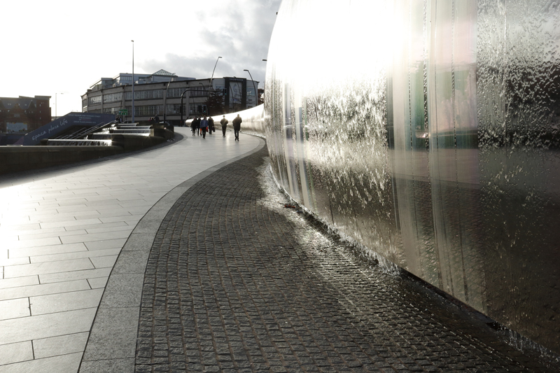
Image 1
View 1500 x 1000
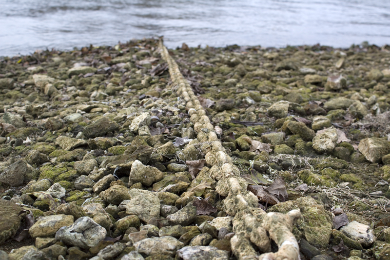
Not an entirely straightforward shot. There are lines diverging and converging all over the place. Sometimes this is down to architectural design, and sometimes down to perspective. I wouldn’t like to predict which way the viewer’s eye might be drawn around the image, but I think it’s safe to say it doesn’t begin in the conventional ‘top-left’.
I’m not actually sure I buy into the idea that ‘In the same way that we read a book from the top-left, we read most photographs from the top-left corner…'(Diprose & Robbins, 2012:33). Maybe it’s my slightly miswired brain, but I never look at images that way, and this image doesn’t strike me as one that would lend itself well to viewing in such a way. Speaking entirely for myself, with this image, I start on the bottom-right, get swept upwards, to either the left or the right of the fountain, stop at the building in the background, and then move back down on the opposite side.
On a technical level, I found myself frustrated here, as with most of the other shots in this series, with having to keep the camera in fully automatic mode. It produced some surprising shots, but some of its choices, I would not have made. Here, I would have gone for a narrower aperture and longer exposure. While the closer streams of water being frozen in time are nice, I’d gladly exchange them for a little more clarity in the background. (or maybe less… and blur the background out dramatically).
Image 2
View 1500 x 1000
A more conventional shot. The lines may be curvy, but the path is easy to follow, and clearly leads the eye into the background.
I’m happy with the settings the camera used here, particularly with how it responded to the light, and to be honest, this new Canon 1300D is producing results that I could only dream of while using my Panasonic FZ50.
Image 3
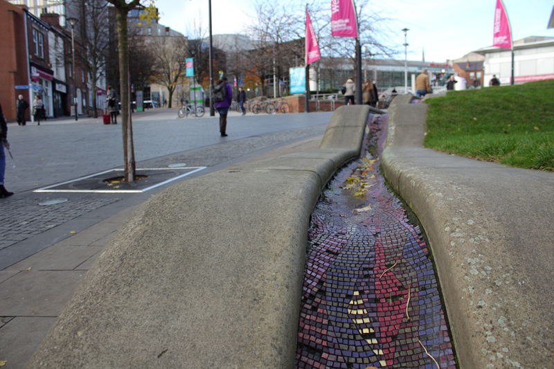
View 1500 x 1000
This is the most fancy gutter I’ve ever seen, and it seems fitting that it’s the only part of the image to be in focus. The lines drawn by the gutter get hidden by the lay of the land, but their continued convergence is implied, if not actually seen, into the distance.
Image 4

View 1500 x 1000
Light glowing on the pavings in the centre of the foreground draws the eye, and then the leading lines redirect the viewer towards the middle ground, where the closer proximity to the plane of focus makes the people and cars stand out. The two youths on the right, almost unnoticed due to being in shadow, were having quite a laugh, as I crouched down, trying to get an interesting shot.
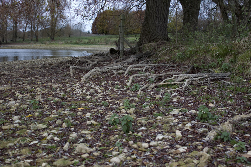
Image 5

View 1500 x 1000
Where the eye is drawn to and ends may vary, depending on your starting point. If you start with the water at the bottom of the steps, you may be drawn up to the point it is flowing from, and go no further. If you start at the bottom left, you are drawn up by the converging lines of the stone blocks, and then swept away into the unseen distance by the lines on the buildings behind.
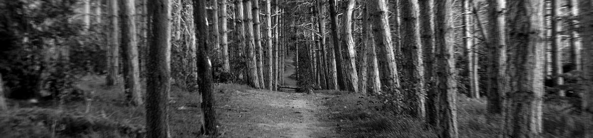
Image 6

View 1500 x 1000
This is another shot where I probably wouldn’t have done things the way the camera chose to, though in retrospect, I think the camera has done a better job than I would have.
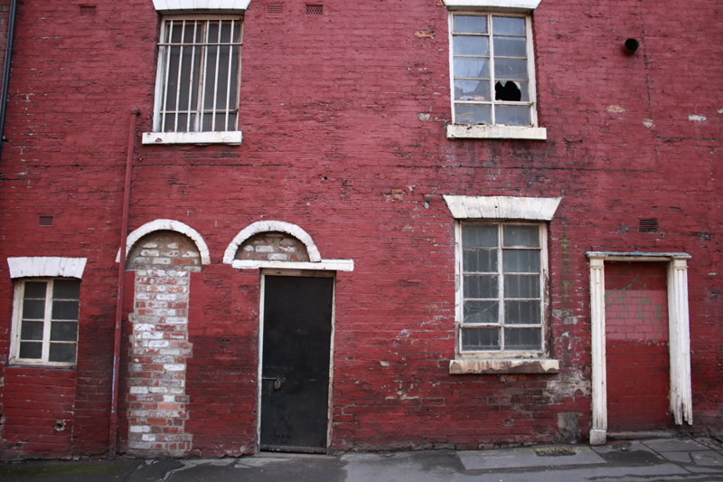
The first thing I see is the writing (making a liar of myself by starting at the top-left)… I’m not sure if this is graffiti or art… given the area, it could be either. My eye is then drawn along the wall and pavement until I see the car and shop in the distance, but then… hold on…. back again to the near-ground…. what’s that wine glass doing there?
Image 7
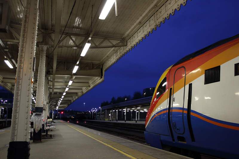
View 1500 x 1000
The row of white painted girders, and the roof line, draw the eye into the distance, only to be drawn back by the yellow line, and then… wow, the blue of the sky matches the blue on the train. And the white on the train matches the white on the girders and roof.
The train seems to add to the suggestion of forward motion into the distance, partly because of the lines of perspective (helped by the sweeping painted lines on its flanks), but also by the very nature of its existence. Trains go forwards… quickly. The fact that it wasn’t actually moving doesn’t really matter. It’s all about implied motion.
There’s another detail which seems to suggest speed and motion, despite it’s complete absence. The fluorescent lights. Their spacing suggests the white lines as seen by a driver on a road or motorway.
Exercise 1.3 (2) Line
Take a number of shots using lines to flatten the pictorial space. To avoid the effects
of perspective, the sensor/film plane should be parallel to the subject and you may
like to try a high viewpoint (i.e. looking down). Modern architecture offers strong
lines and dynamic diagonals, and zooming in can help to create simpler, more
abstract compositions.
Review your shots from both parts of Exercise 1.3. How do the different lines relate
to the frame? There’s an important difference from the point exercises: a line can
leave the frame. For perpendicular lines this doesn’t seem to disrupt the composition
too much, but for perspective lines the eye travels quickly along the diagonal and
straight out of the picture. It feels uncomfortable because the eye seems to have no
way back into the picture except the point that it started from. So for photographs
containing strong perspective lines or ‘leading lines’, it’s important that they lead
somewhere within the frame.
Part 2
Image 1

View 1500 x 1000
This is new for me. The photo with grain silos and poplar trees in Assignment 1 was probably the first time I’d ever deliberately removed all signs of perspective, so this is only the second time.
So, not only are there no leading lines, but most of the perpendicular and parallel lines leave the frame. There are very few whole objects in the shot. The lamps. A small notice. A couple of panes of glass, and the street name. Everything else gets cut off by the frame.
But you still know what you are looking at. I find this interesting.
Image 2
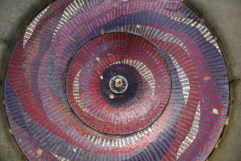
View 1500 x 1000
Connected to the previously shown ‘fanciest gutter I have ever seen’, is the fanciest drain I have ever seen. It’s a big thing, to the point that I couldn’t fit the whole object into the frame, but as per the previous image, cutting off parts of the subject with the edges of the frame doesn’t seem to matter.
I like how the design of the mosaic creates a sense of flowing movement, suggesting the movement of water into the drain, even when there is none. The whole gutter/drain construction outside of Sheffield Hallam University came as quite a surprise to me. I’ve never seen anything like it before. Truth be told… I’ve always lived in towns and villages, where aesthetics have generally been secondary to practicalities, so Sheffield (where all of these shots were taken) is something of a wondrous place to me.
Image 3

View 1500 x 1000
You can see more of what this place is. It might be quite a dull image, were it not for the detail of the brickwork. The normal lay of the bricks is disrupted by sections with diagonal brick patterns. It’s the kind of thing sometimes seen in Tudor architecture, though this is by no means a Tudor building.
I like how the gold colours in the paintwork and signs are almost matched by the gold in the leaves of the tree. This, contrasted with the darker paint, creates quite a happy feel, despite the almost total lack of sunshine. (It was sunny and bright when I got on the train in Worksop, but by the time I reached Sheffield, it was dull as dishwater).
Image 4

View 1500 x 1000
Functional doesn’t have to mean ugly or dull. Overall, the building has a symmetrical shape, but this is broken up by the materials used for the different sections, making for a much more interesting looking construction.
The vertical lines of the trees and lamps, stretching up through the image and matching the lines of the building, while also casting out branches in other directions, add an element of organic chaos, and keep things interesting.
The camera chose to put the plane of focus just on the nearside of the trunk of the tree on the right, making some of the branches the sharpest objects in the image. I don’t know that I would have done this myself (I could have overridden its choice, but I’m new to this camera, so I just let it do its thing)… but it does make for an interesting feel, where the object of our interest is the background of the image.
Image 5

View 1500 x 1000
I *love* this. Of the shots in part 2 of this exercise, this is my favourite.
The light is poor and the colours somewhat muted, but it doesn’t matter (to me). There is so much going on here, and so much detail.
The architecture, words, signs and flags, depict a vibrant culture wilfully, even joyfully, adapting itself to suit another culture. It maintains its own identity, while fitting in, with the host culture.
This whole street was a breath of fresh air to me, and unlike anything anywhere I’ve lived. I could have stood outside every shop and taken photos (I certainly stood outside several), but I was losing the light, and it was very crowded.
While the photographic style is entirely different, and the areas lacked that transitional space between the interior of the shops and the exterior of the street, walking along this street taking photographs reminded me of a passage I read about Eugene Atget.
‘Much of his Parisian material deals with the limited future: food shops where meals will be planned and brasseries where they might be eaten, plus cabarets where time of a different sort will be spent. Hence his interest in ragpicking and junk shops where, in terms of the major metaphor, it will all come to an end in mere material.’ (Jeffrey, 2012)
Image 6
View 1500 x 1000
I really needed a tripod for this…. or to be using a manual mode. There’s a lack of sharpness (due to camera shake?) With an 18mm focal length, the 1/80 second exposure shouldn’t have caused a problem. I may have been shivering.
Anyway…. I love this scene.
I really enjoy photos of dilapidated, abandoned, derelict buildings, and while this place is none of those, it’s certainly seen better days. “It’s grim up north” as the KLF once said… and this location is a reminder of that fact.
The thing that most interests me about this scene…. what on earth is going on with that door?!!
Conclusion
In perspective shots, there are two different sets of lines. Those that are parallel or perpendicular to the frame, and the ‘leading lines’, which draw the eye into the shot, to create depth.
The perpendicular/parallel lines may leave the frame, while the leading lines should not.
There do appear to be circumstances where leading lines do leave the shot and seem to get away with it. In Image 3 of part 1, the lines created by the gutter become hidden by the lay of the land, and this doesn’t seem to cause a problem. Maybe this is because they don’t leave the frame, but are obscured within it. The same seems true of Image 5 of part 1. The lines of the buildings in the background end, though again, not via the edge of the frame.
Something I have found very striking about this exercise is the difficulty in creating an interesting image without using perspective, but also something else.
When using perspective, you can take a subject which, in and of itself, is unspectacular, and you can make an interesting, or eye catching image. When avoiding perspective, to capture an interesting image, the subject itself has to be interesting, and this can make taking such photographs difficult.
This also brings up the old question of ‘does the photograph take itself’? When avoiding perspective, and having the need to find a subject that is interesting in its own right, how much is the aesthetic quality of a good looking photograph down to the photographer?
I believe it comes down to the ability of the photographer to recognise something beautiful, or of interest, and to be able to frame it well. It also comes down to taste. You could say that anyone can see a pretty thing and point a camera at it… but could just anyone frame it well and make the shot work? And could just anyone point a camera at something that is aesthetically quite ugly, and make a photograph that is worth looking at? My opinion is that no, ‘just anyone’ could not. (Having said that, giving a disposable camera to a young child can produce very interesting results).
Here we may come up against the question of framing versus cropping.
Framing is where the photographer carefully positions him/herself, possibly making use of a zoom lense, if one is attached to the camera, to get the best possible composition in the frame. The final composition is achieved in the camera.
Cropping is where an image that has already been taken, is manipulated, either in software, or using an enlarger when developing film, and the area of interest is effectively zoomed in on.
The appeal of cropping is that you can take a pre-existing image, and produce something entirely different from it, with different emphasis, or telling a completely different story.
The negative aspect of this is loss of detail and overall image quality. The more you crop, the more grainy the resulting image will be.
For the best quality image, it is always better to try and get as close as possible to your desired composition while framing, and then use cropping only for fine tuning. That being said, and art being what it is, sometimes grain can be seen as a positive.
Reference
Diprose, G & Robins, J (2012) Photography: The New Basics. London: Thames & Hudson.
Jeffrey, R (2012) How to Read a Photograph. London: Thames & Hudson.


