How To Read a Photograph – Ian Jeffery

I have been fairly hopping from book to book recently, mostly switching from Barthes’ Camera Lucida to Jeffrey’s How to Read a Photograph, and back again.

I can safely say that I’m finding Jeffrey’s book by far the more interesting, but perhaps not in the way intended.

In terms of looking at the history of photography, of learning about the methods and seeing the works of early photographers, it is a very good read. However, so far, it does not actually do what it says on the cover. ‘How to Read a Photograph: Understanding, Interpreting and Enjoying the Great Photographers’.

What I’m finding is that it gives a very detailed interpretation of certain images, but absolutely no explanation of how it came to that conclusion. It seems to me that ‘Interpretations of Photographs’ would be a more accurate title.

As an example, of Julia Margaret Cameron’s image ‘The Angel At The Tomb’ (can be seen at http://collections.vam.ac.uk/item/O129312/the-angel-at-the-tomb-photograph-cameron-julia-margaret/ ) …

Jeffrey (2008:22) says…

‘The tomb was Christ’s, and the angel came down from heaven like an earthquake to roll away the stone which sealed the entrance. Christ, however, had already gone, to the added amazement of Mary Magdalene. According to Matthew the angel was male. What Cameron seems to have done is to present the angel as Mary Magdalene, out of whom Christ has expelled ‘seven devils’. The event took place at first light.’

Fascinating. But how did Jeffrey conclude this? How can a viewer of the photograph in question see the image, and in any way produce such an interpretation? I see a woman with somewhat unruly long hair, with a dark background, and bright light falling across parts of her face and hair.

To produce the interpretation offered by Jeffrey requires extra knowledge which is in no way present within the photograph itself. As suggested by the page on the Victoria and Albert Museum (2016), it would appear that Cameron based her work on Renaissance paintings. Jefferey does not tell us this, and as such, I feel this weakens his ‘interpretation’.  It’s like he’s saying “Here’s a very clever interpretation of this work, but I’m not telling you how I achieved it”… which completely invalidates the title and objective of the book.

To be honest, while I’m finding the book interesting, so far, and based on the title, I’m feeling somewhat cheated.

And while I’m in the mood for grumbling, this does seem to be a recurring theme in my studies. Lots of big conclusions and interpretations are shared, but the method of how to arrive at those interpretations seems to be jealously guarded. I find this is, at best, counterproductive. It’s like my maths teacher used to say to me, all those years ago… “Show your working! How do I know you didn’t cheat?”


Reference

Jeffrey, I (2008) How to Read a Photograph London: Thames & Hudson

Victoria & Albert Museum (2016) The Angel at the Tomb AT http://collections.vam.ac.uk/item/O129312/the-angel-at-the-tomb-photograph-cameron-julia-margaret/  (Accessed on 29/12/2016)

Camera Lucida by Roland Barthes

Introduction

Additional to the ‘Essential Reading’ list (from which I have read ‘Photography – The New Basics’ from cover to cover), this book, among others, was recommended to me by my tutor.

My very first impression, after reading a few pages was “Oh my god! What a pretentious blowhard! Why on Earth would my tutor suggest I read this?!”

It has to be said that the text is verbose, to the extent that Barthes’ use of words appears willfully to obscure his own meaning. I don’t know to what extent this is down to the translation, as the book was not originally written in English. Nevertheless… I sometimes feel that the excessive use of an extensive vocabulary is not always clever. You are trying to convey a message. To deliberately obscure that message with many, many fancy words is not clever… it’s stupid.

I (thankfully) persevered.

My reading style is typically one of ‘read it slowly, and read it all’. I start at the start, and work my way through, pausing and re-reading sections if I think I’ve not grasped something… and continue in this manner until I reach the end.

That doesn’t work for me with this book. The text is so dense, and the (sometimes fairly easy to grasp concepts) spread across several… or even many… pages… it’s easy to lose the message in the “look at me I’m so clever” swathes of blah blah blah.

So I’m writing my own translation as I go, just to make sense of it.

I shall share that here, and maybe my thoughts on it, too.

I should note here that I haven’t done what I maybe should have done. It would have been better if I’d kept my notes grouped by chapter, so that I/you could refer back from my interpretation here, to what is written in the book.  For the sake maintaining my flow while reading the book, though, I merely scribbled down my interpretation as I read, without noting chapter or page numbers. Now being the kind of person that I am… I have started, so I shall go on.

Here we go then….


Camera Lucida by Roland Barthes… an imperfect (and currently incomplete) precis, plus opinions.

Barthes realised it was difficult to categorise photography outside of:

Empirical – Professional/Amateur.

Rhetorical – Landscapes/Objects/Portraits etc.

Aesthetic – Realism/Pictorialism.


He concluded that this was down to the direct link between the subject/object and its representation in the photo. With no object, there was no photo. (This was unlike painting, where the artist could paint objects from their memory or imagination).

This being the case, when you look at a photo, you see a direct physical reproduction of the object.

There being no process of interpretation, such as a style of painting, you just see the object… not the photo.


Barthes acknowledged that his experience of a photograph, as a viewer, seeing an object through the deferred projection of light, is different from the experience of the photographer. The photographer has an idea or emotion in mind when setting the scene, choosing the image to capture. An aspect of photography Barthes had no experience of.


Barthes found himself uncomfortable when knowingly being the subject of a photograph. He couldn’t help but ‘pose’, to try and project his ‘real’ self, but recognised that in doing so, he achieved the exact opposite.

Also, he realised, his character, like everyone’s, is constantly changing and developing, so the photo only captured a fleeting momentary version of ‘him’.


While mental conditions that cause people to ‘see themselves’… out of body experiences, if you like… were often discussed in the past, Barthes notes that the act of seeing oneself in a photograph can be uncomfortable, and so the subject is rarely spoken of.

Historically, he notes, the ability to see yourself as an exact representation is a very recent thing. It brings about questions such as who owns the image?

Barthes refers to ‘four forces’ in portraits.

1: The ‘I’ that I am.

2: The ‘I’ that I want the viewer to see.

3: The ‘I’ that the photographer thinks that I am.

4: The person that the photographer seeks to portray for his own purposes.

This, Barthes suggested, can create a feeling of inauthenticity in portrait photography.


Personal notes

Having only read this far, so far, my impressions are slightly different from my first thoughts.

While the verbose style still annoys me, and makes for very difficult reading, I find the book, and Barthes’ thoughts and ideas interesting.

To be honest, much of what I have read so far, when put into plain English (assuming that I have understood what he is saying) is actually fairly self evident, if not entirely obvious, when you come to think about it. Having said that… I must confess that on much of it, I had never previously thought about it.

Further, this is an important work, for however self evident some of these points may seem now, Barthes was the first (so he claims, and as far as I know) to actually state them publicly.

There are some passages that I have not covered here… some because I have found them entirely incomprehensible, and some, because I found them to be pretentious nonsense. I may be wrong in editing (or rather failing to take notes on such sections) my interpretation in this way, but time is precious, and if I find a section is not useful to me, I’m not going to commit time to making notes on it.

A quick example… (yes, I’m now making a note regarding something I said I wouldn’t make notes on, but humour me)… while talking about posing for portraits, Barthes spoke of his mental processes, and those of the photographer, and likened the moment the shutter release is pressed to some kind of death of the self.

Mmhmm. Okay. It sounds very deep and philosophical, but I’m just not buying it. It reminds me of tales of primitive tribes who refuse to allow their photos to be taken, because it will steal their souls.

I am open to deep thinking. I am very open to art, and artistic interpretation. Heck… I’d be doing the wrong course if I wasn’t. What I’m not open to is … and please excuse my use of language here… ‘deep sounding art bullshit’. That, in my opinion, Barthes is prone to indulging in this, will make reading and interpreting this book challenging. While there is much that is important and useful written here…. it seems interspersed with some well disguised effluent.

It’s possible, maybe even probable, that my view will change, with time and learning. At some point in the future I may look back at what I’ve written here and cringe, but for now, this is where I’m at.

 

Planning

In an unprecedented move,  I’m thinking about what I shall do for assignment 2 before I actually go out and start shooting!

By nature, I’m an opportunist photographer. I go to a pre-decided location with my camera, look around, and if I see a scene that I like, I take photos. That’s it. That’s what I’ve always done, and there’s never been any more thought put into it than that.

Currently, things have not changed… much. Just a little.

What I have right now is a (relatively) clearly defined objective.

Collecting

Brief

Create a series of between six and ten photographs from one of the following options, or a subject of your own choosing:

  • Crowds
  • Views
  • Heads

Okay then….

Crowds? Nope. I don’t like ‘people’ in general, and the last time I was in a public place with a camera, a chap came up to me and very sternly demanded that if I had taken any photos with him in them, that I delete them there and then, while he watched. I complied without question, obviously, but found the experience unsettling.

Views? Maybe. I’ll come back to this in a moment.

Heads? File under ‘people’.

Coming back to ‘Views’ after the aforementioned moment. My wife is on Christmas holiday from work, which is nice. For her work, she travels a lot by car, and happens to pass through some beautiful locations. She often remarks that I would probably love some of the places she has seen, and would no doubt have my camera out at most of them. So… given that she has some free time, she’s going to drive us to a few of these locations, so I can see what she has seen…. and take photos.

This is probably a bit (no… it’s a lot) hit or miss. ‘Views’ is a vague subject, and while it’s one I’m very comfortable shooting, the potential for different types of location, not to mention weather, may cause difficulties when it comes to creating a coherent and unified ‘collection’ of images.

We’ll visit the places, I shall take the shots, and we’ll see how they come out… but with having a coherent set in mind, I have a Plan B.

Plan B comes under “or a subject of your own choosing”.

I like architecture. I like old things. What kind of old architecture could fall into a well defined category that could form a coherent set of images, while being numerous enough to find easily?

Churches!

Castles would be cooler, but they’re not so numerous,  and can involve significant travel and entry costs. My budget is minimal to non-existent, so… churches it is.

The trick here is actually to keep the number of shots down. It would be very easy to find six to ten churches and include one photograph of each, but that would be very predictable, and potentially quite dull.

What I would really like to do is go back to the village on the Northamptonshire/Buckinghamshire border where I grew up, and photograph several of the churches in that area, as they hold real nostalgia for me. (I didn’t attend them… I’m not remotely religious… I just like the buildings). Sadly, time and funds preclude this.

I had the idea of taking night shots of churches, as I really like low light photography (though I may actually not be very good at it)… and this would certainly solve the issue of inconsistent weather / lighting.

I also like the idea of visiting around 3 different churches, taking a wide exterior shot with deep depth of field, a tighter, detail shot (gravestones?) with shallow depth of field, and if at all possible, an interior shot (sunlight flooding through stained glass can look incredible).

I shall keep all of those ideas in mind, visit various local churches at various hours, and find out what’s possible. Should be interesting.


Project 2: Lens Work

Deep Depth of Field

The coursework says of Guy Bourdin  ‘Bourdin photographed everyday scenes in a way which suggests an intense psychological situation. The exact source of the unease is impossible to pin down to any specific point within the frame.’ (OCA, 2016:51)

I find myself perplexed by this claim, as his images appear to feature surreal situations and people/objects, which are quite obviously the focus of unease. For example, you have three female legs, tied up, laying on a railway track.  https://www.louise-alexander.com/wp-content/uploads/11496-ART-01D-GB.jpg (Bourdin, 1970)

Yes, there is use of deep depth of field, and this can create an unnatural atmosphere in an image, but I disagree with the choice of Bourdin’s work as an example of this, for clearly, his features more specific and obvious elements that create the unease.

Of Bourdin’s work, I’d say his impact is in taking the imagery of fashion photography, and exaggerating it, with surreal elements. These are not every day scenes, in  the sense that you’re very unlikely to stumble across them in your day to day life, but it could be argued that you might come across such scenes in a magazine in a waiting room (assuming you don’t buy such things yourself)… but with a twist.

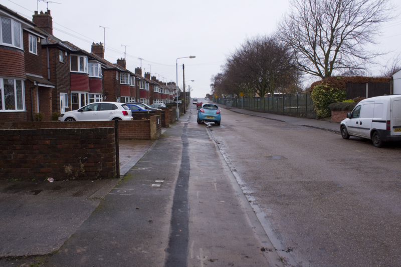
On the idea of deep depth of field creating a sense of unease… I can relate to this description, having created just such a feeling, by accident, in my own work.

exercise2-7-0-800

View 1500 x 1000

This image creates a strange sensation in me that I have been unable to put my finger on. Initially I believed it to be the positioning of the blue car, or maybe the wide angle of the lens, but my reading today leads me to believe the deep depth of field may be a major part of this feeling.


Shallow Depth of Field

Looking at Mona Kuhn‘s Evidence series (the link in the coursework is dead, so I found a video of her series book here https://vimeo.com/92491074 (Kuhn, 2007)) I feel the shallow depth of feel has a twofold effect in terms of intimacy.

In the way that it mimics the workings of the human eye, the feeling is very natural, the viewer feels themself in the scene, and among the models. Given that the models are naked enhances this sense of intimacy.

There seems also to be another effect… one of detachment and distancing. The blurring of areas and people within the scenes means the viewer can never quite see everything there is to see. This is accentuated by the inclusion of reflections in some images, putting yet another barrier between the viewer and the subject matter.

To me, this combination of intimacy, and forced distancing creates a feeling of tension. I feel both the allure of the closeness, but also repelled by it (I don’t like being around people)… and then frustrated by the distancing created by the partial obscuring through blur and glass…. but also somehow relieved by it.  I want to get closer! I want to run away!

Doug Stockdale (2011) says of Kuhn’s use of depth of field…

‘ There is more of sense of closeness conveyed by the proximity of the subjects to her lens, and the positions of the subjects amongst themselves. It does not appear to be always an easy  or comfortable relationship, with the viewpoint moving forward, then backing off, the focus shifting to other object emerging between us, the viewer, and her subjects. Likewise, her subjects are not always in the focus, sometimes sharply delineated, other times shifting to the background, becoming hazy, indistinct and less personable.’

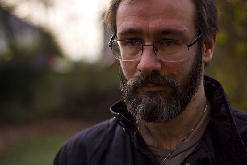
Looking at my own work, while this first image (below) has a blurred background, the depth of field is not what I would call super shallow, so there is not a great sense of intimacy.

portrait1-800

This one (below) on the other hand has a depth of field that is so shallow, not even all of my face is in perfect focus. The effect is one of feeling very close, and it’s just as well I’m (almost) smiling in the photo, or it could potentially feel very uncomfortable to look at.

portrait2-800


Reference

Bourdin, G. (1970) multi colour tights tied up legs train track. At: https://www.louise-alexander.com/wp-content/uploads/11496-ART-01D-GB.jpg (Accessed on 14/12/2016)

Kuhn, M (2007) Evidence. At: https://vimeo.com/92491074 (Accessed on 14.12.2016)

Open College of the Arts (2016) Photography One: Expressing Your Vision. Barnsley

Stockdale, D (2011) Mona Kuhn Evidence. At: https://thephotobook.wordpress.com/2011/01/16/mona-kuhn-evidence/ (Accessed on 14/12/2016)

Exercise 2.7

‘Use a combination of small apertures and wide lens to take a number of photographs
exploring deep depth of field. Because of the small apertures you’ll be working with
slow shutter speeds and may need to use a tripod or rest the camera on a stable
surface to prevent ‘camera shake’ at low ISOs. Add one or two unedited sequences,
together with relevant shooting data and an indication of your selects, to your
learning log.
Achieving deep depth of field might appear easy compared to the difficulties of
managing shallow depth of field. We’re surrounded by images made with devices
rather than cameras whose short focal lengths and small sensors make it hard
to achieve anything other than deep depth of field. The trick is to include close
foreground elements in focus for an effective deep depth of field image. Foreground
detail also helps to balance the frame, which can easily appear empty in wide shots,
especially in the lower half. When successful, a close viewpoint together with the
dynamic perspective of a wide-angle lens gives the viewer the feeling that they’re
almost inside the scene.’

Day 1

The weather was terrible. The light was terrible (it has been for weeks). I took around 40 shots, but… meh.

Example 1

exercise2-7-0-800

View 1500 x 1000

2-7-1-exif

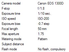
The composition on this image should not work. The blue car is almost slap bang in the middle of the shot, and that’s a big no-no… but for reasons that I can’t explain, I really like how this looks.

There are areas that look like they might be out of focus, until you look closely, and realise that they are focused correctly. It may be to do with the light, reflecting off the pavement.

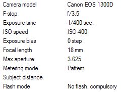
Despite the lack of wide open space, this image demonstrates how a wide angled lens and small aperture produce a deep depth of field, keeping everything in focus, from the front of the image, to the back.
 

Example 2

exercise2-7-11-800

View 1500 x 1000

2-7-2-exif

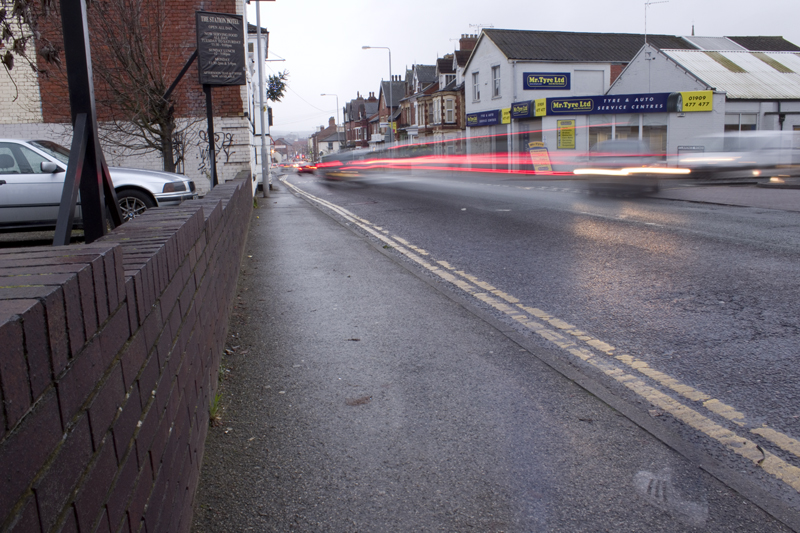
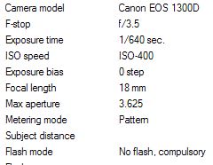
Not an ideal shot for demonstrating depth of field, as only a small area of the image contains distant objects, but even so… it does demonstrate clear focus from front to back… and I like the shot.

I was fully expecting the car lights to be extended through the image, due to the long exposure time, but was amused to see the ghost trainer in the bottom right, where someone had walked into the shot.


Example 3

exercise2-7-22-800

View 1500 x 1000

2-7-3-exif

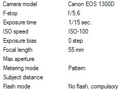
While focus is maintained from near to far, clarity is lost towards the distance, due to poor light, and persistent drizzle.

The image may look underexposed, but it was getting dark, and I had to use brightness compensation to prevent the camera from producing an image that looked lighter than the actual scene. Sometimes you want things to look lighter than they are… like night photography, but in this case, I wanted to show just how dark and miserable a day it really was.


Day 2

I got up early to take my car for a service and MOT and was amazed to find decent light for the first time in weeks. Needless to say, once I’d dropped the car off, I went back home, grabbed my camera, and went for a walk up behind the golf course.

Example 4

exercise2-7a_0-800

View 1500 x 1000


2-7-4-exif

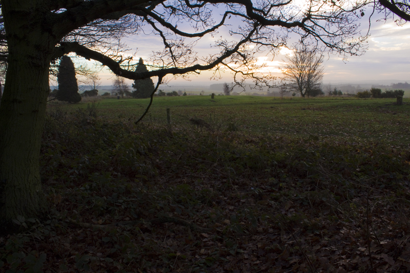
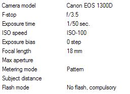
I was standing in shade, among some trees on the edge of the golf course. This made for an interesting graduation from dark to light, which along with the trees in the foreground, adds to the feeling of depth.


Example 5

exercise2-7a_4-800

View 1500 x 1000

2-7-5-exif

Exposure compensation was needed to stop the sky from being blown out, and then the RAW file tweaked in Camera RAW on Photoshop to recover some detail in the dark areas.

The far distance is only a thin sliver through the middle, but it serves its purpose.


Example 6

exercise2-7a_5-800

View 1500 x 1000

2-7-6-exif

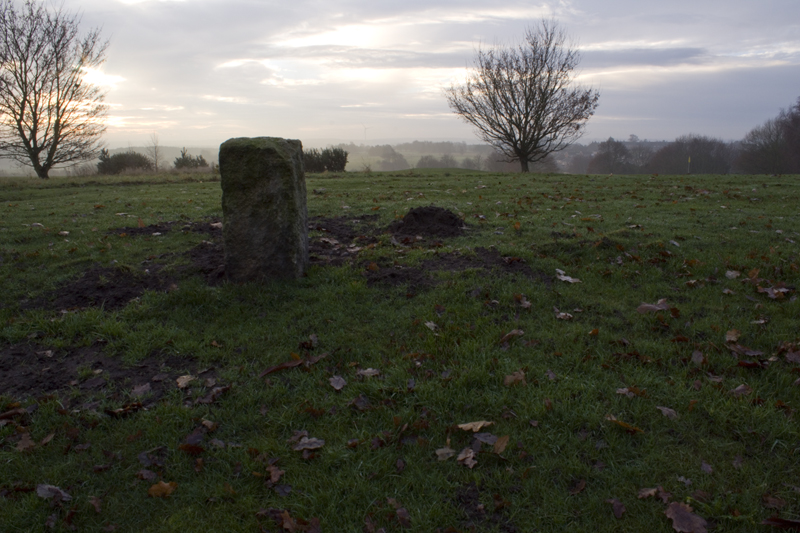
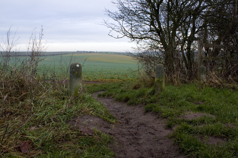
Not some neolithic standing stone, so much as a boundary marker on the golf course, I think.

More tweaking of levels on the RAW file were needed here.


Example 7 (sequence)

No processing has been done to these shots, beyond resizing. Click on the thumbnails to see the 1500 x 1000 versions.

exercise2-7a_8-300  2 exercise2-7a_9-300

3 exercise2-7a_10-300  4 exercise2-7a_11-300

5 exercise2-7a_12-300  6 exercise2-7a_13-300

exercise2-7a_14-1500

View 1500 x 1000

8 exercise2-7a_15-300  9 exercise2-7a_16-300

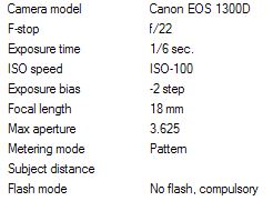
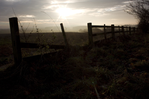
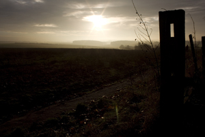
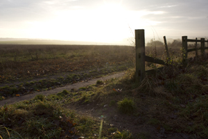
I wouldn’t say any of these are perfect images for demonstrating deep depth of field, as while there is good focus from foreground to distant background, the detail in the distance is lost in the haze. However, I was having so much fun playing with the light, and love the way they look, so chose to include them here regardless.

Settings for all of these images are the same, except for the shutter speed, which varies between 1/10th and 1/50th of a second.

2-7-7-exif


Example 8

exercise2-7a_26-800

View 1500 x 1000

2-7-8-exif

There’s more deep depth of field in view here. Pity I’d lost the light at this point.


Example 9

exercise2-7a_28-800

View 1500 x 1000

2-7-9-exif

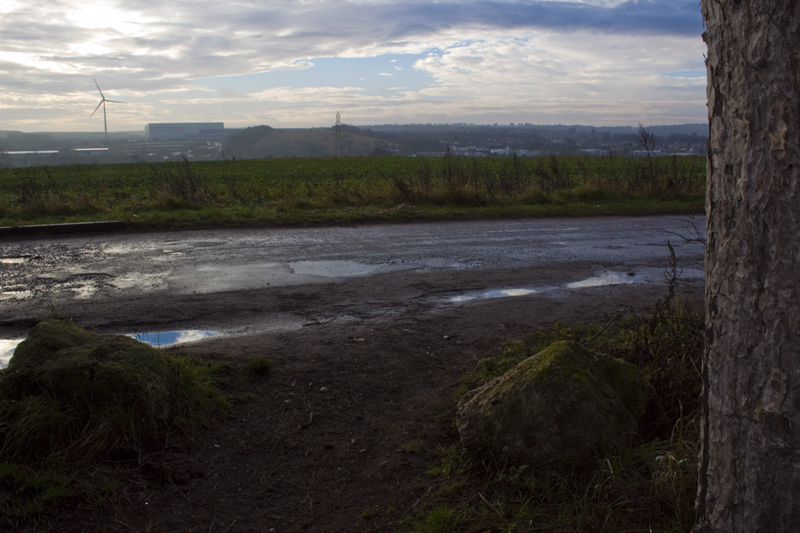
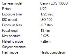
In terms of composition, I feel this image is quite weak. However, the depth of field is very deep, and I really like the colours. While use of the camera’s built in flash lit the bark on the tree trunk nicely, a little tweaking in Camera RAW was needed to retain the detail in the rocks,


Exercise 2.6

‘Use a combination of wide apertures, long focal lengths and close viewpoints to
take a number of photographs with shallow depth of field. (Remember that smaller f
numbers mean wider apertures.) Try to compose the out-of-focus parts of the picture
together with the main subject. Add one or two unedited sequences, together with
relevant shooting data and an indication of your selects, to your learning log.
Wide apertures create shallow depth of field, especially when combined with a long
focal length and a close viewpoint. In human vision the eye registers out-of-focus
areas as vague or indistinct – we can’t look directly at the blur. But in a photograph,
areas of soft focus can form a large part of the image surface so they need to be
handled with just as much care as the main subject.
Don’t forget that the camera’s viewfinder image is obtained at maximum aperture for
maximum brightness and therefore at the shallowest depth of field. Use the depth of
field preview button to see the actual depth of field at any particular aperture. (This
is especially useful in film cameras where you don’t have the benefit of reviewing a
shot immediately after you’ve taken it). It’s surprising to see the effect that a single f
stop can have on the appearance of an image.’

All images in this series were shot using a Yongnuo 50mm prime lens. Basically a cheap (but effective) copy of the Canon ‘Nifty Fifty’. This equates to 80mm (35mm equiv) on the 1300D’s cropped sensor.

All but the first image were shot using manual focusing.

The camera was mounted on a tripod for all shots.

Example 1

1exercise2-6-800

View 1500 x 1000

1exercise2-6exif


Example 2a

2exercise2-6-800

View 1500 x 1000

2exercise2-6exif

Example 2b

3exercise2-6-800

View 1500 x 1000

3exercise2-6exif

Nothing clever or fancy going on here. I was just playing with the focus point, still marvelling at the shallow depth of field that can be achieved. Just a centimetre or so closer to the lens makes a significant difference to the level of blur on the cables in the background on the lower left.


Example 3a

4exercise2-6-800

View 1500 x 1000

4exercise2-6exif

Example 3b

5exercise2-6-800

View 1500 x 1000

5exercise2-6exif

I moved the focal point fractionally. The first one is focused on the plate just below the front ‘grill’. The second is focused on the ‘plunger’. While the effect this has on the overall look of the dalek, and which parts are in or out of focus, is subtle, it also has an effect on the lighting of the scene. This is most noticeable when you’re able to flick quickly between the two images (Open the enlarged images into separate tabs and then flick between them).


Example 4a

6exercise2-6-800

View 1500 x 1000

6exercise2-6exif

Example 4b

7exercise2-6-800

View 1500 x 1000

7exercise2-6exif

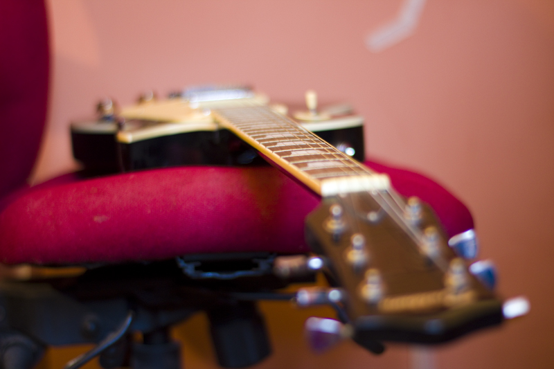
I like the idea behind these images, but the composition suffers due to less than ideal positioning of the guitar, and masking tape stuck on the wall in the background. More time and attention to detail were needed.


At this point, I realised I was supposed to include images that hadn’t been processed (all of the above have had levels adjusted, though none were cropped or otherwise tinkered with). I also hadn’t tinkered with aperture settings on the above, settling merely to tweak the focal distance slightly. So, with this in mind, the next three images are completely unprocessed, except for resizing, and demonstrate three f-stop settings.

Example 5a

8exercise2-6-1500

View 1500 x 1000

8exercise2-6exif

Example 5b

9exercise2-6-800

View 1500 x 1000

9exercise2-6exif

Example 5c

10exercise2-6-800

View 1500 x 1000

10exercise2-6exif

Again, the differences between these images are best seen when flicking through them in sequence. Suffice to say, the difference in depth of field between f1.8 and 3.5, when up close, is significant.

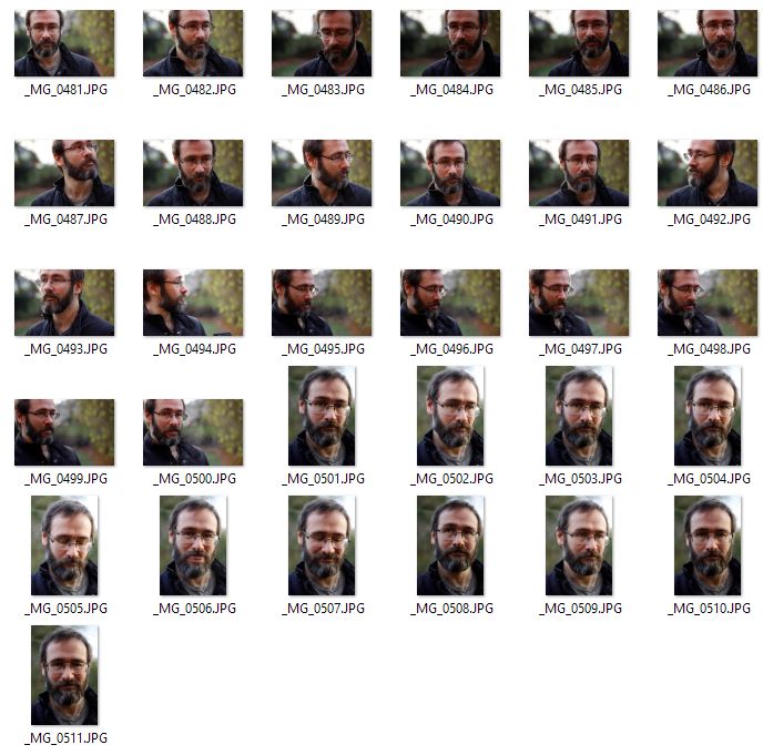
Contact Sheet

contactsheet


Conclusions

In addition to the conclusions I mentioned already, (very small adjustments to close up focal distances have significant effects on blur and lighting, as do changes to aperture)… what really struck me when doing this exercise was the fact that this 50mm (80mm equiv) could shoot objects up close. I had considered it mostly suited to portraits and as a short telephoto for shooting middle distance. It turns out it’s minimum focal distance is 1.5ft.

I also discovered very quickly that trying to take shots like these, indoors and handheld, doesn’t work. There’s not enough light to allow a fast enough shutter speed, so without a tripod, everything comes out blurred.

Exercise 2.5

‘Find a subject in front of a background with depth. Take a close viewpoint and zoom
in; you’ll need to be aware of the minimum focusing distance of your lens. Focus on
the subject and take a single shot. Then, without changing the focal length, set the
focus to infinity and take a second shot.
The closer you are to the subject, the shallower the depth of field; the further from
the subject, the deeper the depth of field. That’s why macro shots taken from very
close viewpoints have extremely shallow depth of field, and if you set the focus at
infinity everything beyond a certain distance will be in focus.
As you review the two shots, how does the point of focus structure the composition?
With a shallow depth of field the point of focus naturally draws the eye, which goes
first of all to the part of the image that’s sharp. It generally feels more comfortable if
the point of focus is in the foreground, although there’s nothing wrong with placing
the point of focus in the background.’

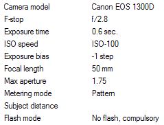
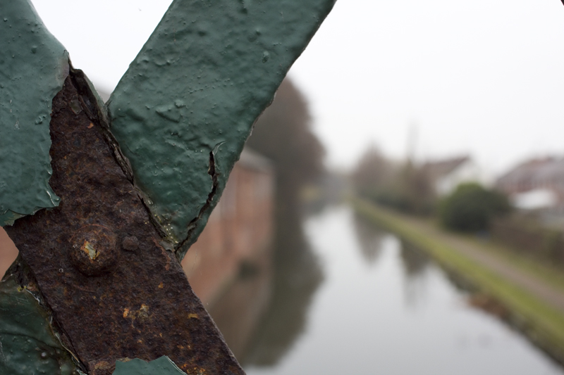
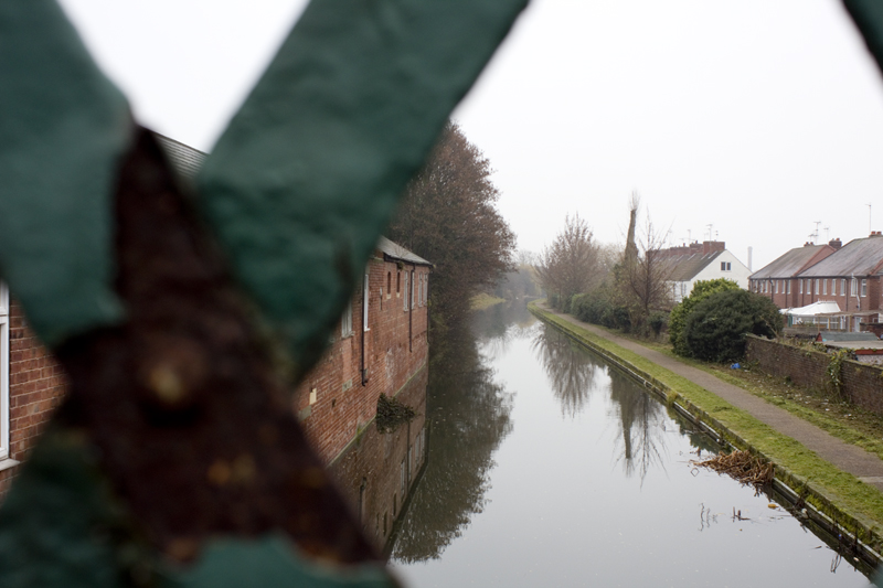
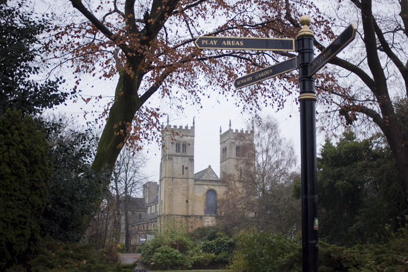
This series was shot using a Vivitar 28mm f2.8 fully manual lens, converted from an old film camera, for use with the Canon EOS series. (28mm on cropped sensor equates to around 45mm on full frame sensor) So, apart from having no auto-focus features, this means there is no EXIF data collected from the lens, so I had to note everything down by hand. I also had to make use of exposure compensation quite a lot, as metering with this lens seems to be way off.

Example 1a

4exercise2-5-800

View 1500 x 1000

Camera: Canon EOS 1300D.  Mount: Tripod. Lens: 28mm.  Aperture: f5.6.  Focal Distance: 0.3m  ISO: 200. Exposure Compensation: -1

Example 1b

3exercise2-5-800

View 1500 x 1000

Camera: Canon EOS 1300D.  Mount: Tripod.  Lens: 28mm.  Aperture: f5.6.  Focal Distance: Infinity.  ISO: 200. Exposure Compensation: -1

This pair of images demonstrates very well how focusing on a close object, even with a medium aperture setting, blurs out the background, and vise versa, when focusing on the distance.

Finding a scene where the close object and background scene are of equal interest proved quite challenging, but on this one at least, I’m quite happy. There’s something about rusty metal that I find visually appealing, while canal scenes have a very calming sense of nostalgia.


Example 2a

7exercise2-5-800

View 1500 x 1000

Camera: Canon EOS 1300D.  Mount: Tripod.  Lens: 28mm.  Aperture: f2.8.  Focal Distance: 0.9m.  ISO: 200. Exposure Compensation: -1

Example 2b

8exercise2-5-800

View 1500 x 1000

Camera: Canon EOS 1300D.  Mount: Tripod.  Lens: 28mm.  Aperture: f2.8.  Focal Distance: 10+m.  ISO: 200. Exposure Compensation: -1

Without auto-focus, focusing on the iron gate proved very difficult. The light was poor, while the gate was in shade and of a very dark colour itself. Tricky.

It’s worthy of not that, despite using a wider aperture, because the camera was further from the close object (the gate) than in the previous pair of shots, the background when focusing on the gate is still fairly visible and identifiable.


Example 3a

15exercise2-5-800

View 1500 x 1000

Camera: Canon EOS 1300D.  Mount: Tripod.  Lens: 28mm.  Aperture: f2.8.  Focal Distance: 9m.  ISO: 200. Exposure Compensation: +0.3

Example 3b

16exercise2-5-800

View 1500 x 1000 

Camera: Canon EOS 1300D.  Mount: Tripod.  Lens: 28mm.  Aperture: f2.8.  Focal Distance: 15m.  ISO: 200. Exposure Compensation: +0.3

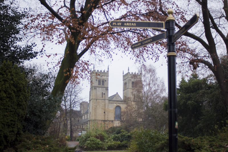
In the first image, I focused on the ‘Play Areas’ sign, but with a focal distance of 9 metres, despite the wide aperture, the background remained fairly well (if not quite perfectly) focused.

In the 2nd image, while focusing on the church, the sign blured out a little, but not to the point that it is illegible.


Conclusions

This exercise has proven very useful in demonstrating the effect the distance from a foreground object has on depth of field. Regardless of aperture, a very close foreground object will produce a shallower depth of field, and the further from it you get, the deeper the depth of field becomes (albeit potentially limited by aperture setting).

I learned something else from the exercise too.

Working with a fully manual lens is very satisfying. It forced me to slow down, as not only did I have to fiddle with the lens to set the aperture, and then tweak it by fractions, to try and achieve a good focus, I also had to pause between shots to note down the settings for each shot.

The result of this, when compared with the shooting I did in Sheffield using the kit lens, was that I was far more careful and deliberate about what I was doing. While this had downside of removing much scope for opportunistic shots, I found the shots I did take were better composed… or rather, it took far fewer shots to achieve the correct composition.

Exercise 2.4

‘Find a location with good light for a portrait shot. Place your subject some distance in
front of a simple background and select a wide aperture together with a moderately
long focal length such as 100mm on a 35mm full-frame camera (about 65mm on a
cropped-frame camera). Take a viewpoint about one and a half metres from your
subject, allowing you to compose a headshot comfortably within the frame. Focus
on the eyes and take the shot.’

‘Longer focal lengths appear to compress space, giving a shallower depth of
acceptable sharpness, which is known as depth of field. This makes a short or medium
telephoto lens perfect for portraiture: the slight compression of the features appears
attractive while the shallow depth of field adds intensity to the eyes and ‘lifts’ the
subject from the background.’

Self Portrait

portrait1-800

View 1500 x 1000

portrait1exif

I didn’t have a model to pose for me, so this is a self portrait.

I was able to achieve the framing and focus by using a nice little app on my phone called Canon Camera Connect. This hooks up to my camera via Wi-Fi and, among other things, allows me to use the phone as a remote viewfinder, and take control of the camera from a distance.

Using a 50mm prime lens, at f1.8, and with me standing about a metre and a half from the camera, the background blurs out very nicely.

The framing of this shot may not be exactly what was asked for, as the top of my head goes out of the top of the frame. I’m unsure how this is viewed in terms of photographic conventions, but I used this framing largely out of habit, as it’s pretty much standard when shooting vlog style YouTube videos.

Personally, I prefer this kind of framing, as it feels more… in the moment, and less artificially posed.

The light is coming from behind me, but just enough to one side to make shooting from this angle workable. I took several other shots, some without the empty space on the upper left of the shot, and this one seemed to work the best.

The moody, ‘thoughtful’ look is pretty much standard me. People assume I’m in a bad mood, but that’s just how I look when I’m not smiling.  “Cheers up” people say. Grr.


Edit….


Okay, I felt the need to try some shots with the required framing, so went back out into the garden. (It’s freezing out there!)

I don’t think the auto-focus is fixing on my eyes, which is a pity. It wouldn’t be a problem if shooting a model, as I’d just switch over to manual focus, but when doing self portraits like this… I don’t know. Must see if it will respond to touch screen commands to tell it where to focus.

Anyway…

portrait2-800

View 1000 x 1500

portrait2exif

Hey would you look at that! I almost cracked a smile 😉

The depth of field is very shallow, as I was standing a little closer to the camera for this shot, and even though my eyes aren’t quite in perfect focus, I do like the overall effect.

The lighting is different too, as it was later in the afternoon, though I’m not certain I’d say it’s better. Just different.


Contact Sheet

portraits1contactsheet


Exercise 2.3

‘Choose a subject in front of a background with depth. Select your shortest focal
length and take a close low viewpoint, below your subject. Find a natural point of
focus and take the shot.
You’ll see that a very wide lens together with a close viewpoint creates extreme
perspective distortion. Gently receding lines become extreme diagonals and rounded
forms bulge towards the camera. Space appears to expand. The low viewpoint adds
a sense of monumentality, making the subject seem larger than it is, and tilting
the camera adds to the effect as vertical lines dramatically converge. Not the ideal
combination for a portrait shot!’

Example 1

exercise2-3_3-800

View 1500 x 1000

1exif

There’s noticeable distortion of the objects on the background, while the foreground object is very imposing and ‘in your face’.


Example 2

exercise2-3_4-800

View 1500 x 1000

2exif

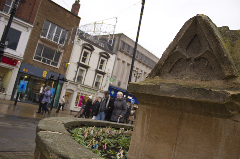
I’m not noticing so much distortion here… (though the roofline of the rightmost building does seem to be pulled down onto the stone carving in the foreground), but the off kilter viewpoint makes for a very dynamic shot, bringing attention to and accentuating the motion of the people in the background.


Example 3

exercise2-3_11-800

View 1500 x 1000

3exif

Distortion seems to be subtle here, and indeed, on all of these shots. I’m not sure how much that is down to the kit lens being a bit ‘vanilla’, or if I’m just doing it wrong. There is clearly distortion, but but none of it is what I’d consider extreme. That being said, it may just be that I’m used to seeing such images, and my expectation of what constitutes ‘extreme’ is what’s been distorted.

The lack of any leading lines in these shots is probably a factor too. I think I’ll need to come back to this.

Exercise 2.2

‘Select your longest focal length and compose a portrait shot fairly tightly within the
frame in front of a background with depth. Take one photograph. Then walk towards
your subject while zooming out to your shortest focal length. Take care to frame the
subject in precisely the same way in the viewfinder and take a second shot. Compare
the two images and make notes in your learning log.

As you page between the two shots it can be shocking to see completely new
elements crash into the background of the second shot while the subject appears
to remain the same. This exercise clearly shows how focal length combined with
viewpoint affects perspective distortion. Perspective distortion is actually a normal
effect of viewing an object, for example where parallel train tracks appear to meet
at the horizon. A ‘standard lens’ – traditionally a 50mm fixed focal length lens for
a full-frame camera (about 33mm in a cropped-frame camera) – approximates the
perspective distortion of human vision (not the angle of view, which is much wider).
A standard lens is therefore the lens of choice for ‘straight’ photography, which aims
to make an accurate record of the visual world.’


Example 1

Not a very inspiring shot. This was simply the first object I came across that fit the criteria of the exercise. As a photo, I can’t say I’m happy with this on any level, other than it demonstrates the difference between a 55mm shot at distance, and an 18mm shot up close.

55mm

1exercise2-2_1-800

View 1500 x 1000

1-55mm


18mm

2exercise2-2_2-800

View 1500 x 1000

1-18mm


Example 2

Not really giving in to my goth roots… it’s just that the graveyard was quiet, and I don’t much like shooting around people.

Again, not a very inspired or inspiring shot, but it served a purpose.

55mm

3exercise2-2_4-800

View 1500 x 1000

2-55mm


18mm

4exercise2-2_5-800

View 1500 x 1000

2-18mm

Example 3

Now we’re getting somewhere.

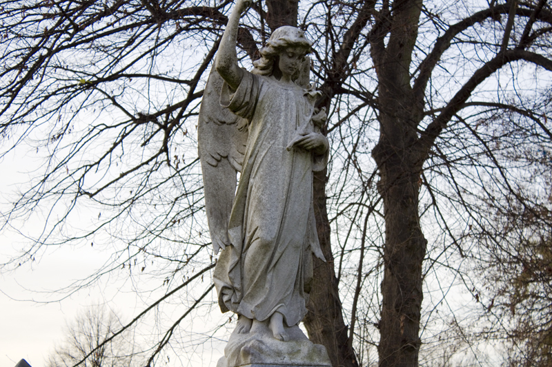
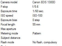
55mm

5exercise2-2_8-800

View 1500 x 1000

3-55mm


This!

(I couldn’t quite match the viewing angle of the 55mm shot, as the statue is above my head.)

18mm

6exercise2-2_9-800

View 1500 x 1000

3-18mm


Conclusions

From this exercise I concluded 2 things.

  1. Shots with a longer focal distance do not look the same as shots framing the same object, closer up, using a shorter focal distance. The shorter focal distance shot fits more of the surrounding scene into the frame, but also causes distortion to the lines and objects.
  2. The 55mm shots look, to be blunt, flat, wooden and dull, while the 18mm shots feel fluid, full of space and life… though somehow kind of surreal.