Exercise 3.2(c)

Another demonstration of the use of shutter speed when representing movement.

In a darkish room, I played a vinyl record (Bowie At The Beeb… disk 2, if you’re interested) and placed a small finger puppet on the centre of the LP. I then focused on this puppet with the camera set (initially) to shutter priority mode. I tried different shutter speeds.

After this I set to fully manual mode and played around a bit.

Image #1

recorddeck1_800

“Hi mum!”

View 1500 x 1000

recorddeck1exif

Even at f2.8 with ISO 3200, at 1/20th of a second this is underexposed. It was the slowest setting I could actually make the finger puppet visible. For a faster shutter speed, you’d need a flash.


Image #2

recorddeck2_800

“Weeeeee!”

View 1500 x 1000

recorddeck2exif

Slowing things down to 1/8th of a second. Motion blur is very evident, while things are a bit brighter. Still requires ISO 3200 which results in an unpleasantly noisy image.


Image #3

recorddeck3_800

“Aaaaagh!”

View 1500 x 1000

recorddeck3exif

1/4 second. Brighter, very blurred, and still needing high ISO.


Image #4

recorddeck4_800

“Please….. make it stop!”

View 1500 x 1000

recorddeck4exif

At 30 seconds, the tone arm is also showing motion blur.


Image #5

recorddeck5_800

“Oh my God, I’m gonna be sick!”

View 1500 x 1000

recorddeck5exif

At this point I switched to manual mode and stopped down to f11 and set ISO 100. I then began flicking a torch across the finger puppet, to try and capture sharp(ish) ‘ghosts’ as it went round. I failed.


Image #6

recorddeck6_800

“WAAAAAHHHHHHHHHHHHH!!!!”

View 1500 x 1000

recorddeck6exif

Now I tried just flicking the torch across the finger puppet while it was in just one part of the rotation.


Image #7

recorddeck7_800

“Dammit… I’m calling my union. I didn’t sign up for this!”

View 1500 x 1000

recorddeck7exif

For this shot, I just swiped the light from the torch across the record once, as quickly as I could, trying to time it so that the finger puppet was facing the camera.

Exercise 3.2(b)

The Blurry Man

I find myself inspired by the work of Francesca Woodman. http://www.tate.org.uk/art/artworks/woodman-space-providence-rhode-island-1975-1978-ar00350

The way she used long exposures to blur the movement of her body, produces images that I find fascinating.

The representation of movement is something which interests me, though unlike Woodman, and indeed, diverging from the point of this exercise somewhat, my real interest is in representing the movement of objects, or people, not through space, but through time.

Using the methods demonstrated by Woodman can achieve this objective, though whether a casual viewer would appreciate the fact that time rather than movement is the subject here, I can’t say.

All of this is working towards a larger objective, of which I have hinted previously, but still have not spoken yet. Patience please. I’m not quite there yet.

So… here’s what I did today.

With my camera set on a tripod in the garden, pointing towards the garden shed, where we have assorted furniture and garden objects effectively abandoned (we’ll hire a skip at some point, but for now, this is where they rest). It looks deliberately arranged, but it’s just how things have been dumped over time.

Despite the requirement of the exercise to use shutter priority mode, I had my camera set to full manual. I couldn’t achieve the effect I wanted otherwise.

I placed an adjustable neutral density filter on the lens, set an initial aperture of f22, ISO of 100, and a shutter speed of 30 seconds.

Next I focused on the chair, set a 2 second timer, pressed the shutter release and ran to stand behind the chair.

For the 30 seconds that the shutter was open, I… well… I jiggled… I suppose you could call it. I stood and fidgeted. Not moving a great distance in any one direction, but trying to make sure no part of my body remained still.

I used various aperture settings, with various ND filter settings and various shutter speeds…. with varying results.

What I discovered is, when it comes to adjustable ND filters, you get what you pay for. Mine was very cheap, and frankly, it’s quite rubbish. When adjusted to extreme settings, it doesn’t darken the frame evenly, rather, it darkens a cross shape across the middle of the frame, leaving the corners overexposed.

This forced me to opt for a tighter aperture setting than I really wanted… though it also caused me to try some extreme processing of the RAW files, just to see what could be done to recover lost detail. Some of the results are… interesting.

So, here we go….

Image #1

blurryman1_800

View 1500 x 1000

blurryman1exif

Concept:   

As you can see… I am there…. but I am not. I’m not going anywhere. Was I there once? Am I there now? Will I be there in the future?

Maybe all of these things… at the same time.

If, as humans tend to perceive it, time is linear, then I was there.

If however, everything that was, is, and will be, all exists… at once… that all of time exists in one big…. thing…. and we simply don’t have the ability to perceive it… then in that image… it doesn’t matter if I was, am, or will be standing there. I am simply standing there. The blur, caused by movement through space… and through time…. is what I’m using to suggest this.


Technical:

Now, moving away from the interpretation of the image, and back to the technical aspects, I wasn’t entirely happy with using a tight aperture. While there is a certain atmosphere created by this setting, I didn’t really want the buildings in the background to be in such sharp focus, so I tried opening up the aperture.

This is where things started to go away from what I had in mind.


Image #2

blurryman2_800

View 1500 x 1000

blurryman2exif

At f22, with the ND filter darkened by a couple of f-stops, what I saw on the screen was what I got when I took a photo. Unfortunately, this didn’t hold true at f2.8.

The results were massively overexposed, and while I was able to recover some detail from the RAW files in post, enough to create an interesting image, this is not what I wanted.


Image #3

blurryman3_800

View 1500 x 1000

blurryman3exif

Darkening the filter, I discovered the flaw in it’s function, creating a dark cross across the frame, while leaving the corners overexposed, so I stopped down to f5 instead.

The corners are still overexposed, while the buildings in the background remain sharper than I would like them.


Image #4

blurryman4_800

View 1500 x 1000

blurryman4exif

Playing around with the fill light, contrast and vibrancy in post created some very odd effects.


Image #5

blurryman5_800

View 1500 x 1000

blurryman5exif

I tried reducing the exposure time, and it’s getting there, but here you can see the dark cross created by the filter.


Image #6

blurryman6a_800

View 1500 x 1000

blurryman6aexif

Exposure is down to 20 seconds. Still getting a nice blur on the figure, but the dark cross is still evident, with the corners overexposed. Compensating for vignetting in post fixes this a little, but the upper left is still not acceptable.


Image #7

blurryman6_800

View 1500 x 1000

Extreme adjustment of levels on the previous image produced something scary. It’s not what I set out to achieve but I like this!


Image #8

blurryman8_800

View 1500 x 1000

blurryman8exif

Probably as near to what I’d intended as I’m going to get it with this filter. The exposure is quite short, while the aperture is quite tight. The upper left is still overexposed while the buildings aren’t as blurred as I want them. Also, unfortunately, there was a spot of fluff on the filter and it’s caught the light here, creating a faint flare like effect on the right of the image.

There is though a feeling of ‘otherness’ and the blur on the figure is very much still what I wanted.


Conclusion

This is heading in the direction I want to go. It says part of the thing that I want to say.

Must get a better ND filter. Hopefully a very dark non-adjustable one will do the trick…. though I’m not sure how dark they actually make them.


Exercise 3.2(a)

Trying out the technique demonstrated in the intro of Christopher Doyle in the opening scene of Wong Kar-Wai’s Chungking Express https://www.youtube.com/watch?v=MH38QAN80vs

This is really just a first attempt, to work out how to make the method work.

I using a 24mm prime lens, I set the camera to shutter priority mode, with a shutter speed of 1/8th of a second. I set for continuous shooting mode, saving files as 1920 x 1280 jpegs.

Next I sat in my office chair, focused on the door handle, started continuous shooting, and rotated myself in the chair through 360 degrees, and only stopped shooting when I returned to my starting point.

I then loaded all of the resulting images into Sony Vegas Movie Studio Platinum. My camera has a continuous stills shooting speed of 3 images per second, so I imported 3 images into each second of the timeline in the editing suite and then rendered the series as an mp4 video file. The audio was added just to demonstrate the shooting speed of the camera as it captured individual images.

Contact Sheet

contactsheet

Obviously, this is just a proof of concept, done just to find out if I could actually do it at all. I intend to create something a bit more watchable later in the week.

Exercise 3.1

‘Using fast shutter speeds, try to isolate a frozen moment in time in a moving subject. Depending on the available light you may have to select a high ISO to avoid visible blur in the photograph. Try to find the beauty in a fragment of time that fascinated John Zarkowski. Add a selection of shots, together with relevant shooting data and a description of your shooting process (how you captured the images), to your learning log.’

The following were taken in Sheffield on a dull day, using a Canon 24mm (pancake) prime lens, with the camera set to shutter priority mode, and handheld for all shots.

Image #1

sheffieldfountains_10_800

View 1500 x 1000

sheffieldfountains_10_exif

Trying to freeze the movement in what was very poor light proved difficult. I got close to it here, but it’s not quite there. I don’t care much for the compromise settled on by shutter priority mode when choosing ISO and aperture settings. It’s neither one thing or the other in terms of depth of field, and all of the shots in the series were underexposed, requiring some tinkering with the raw files in post.


Image #2

sheffieldfountains_22_800

View 1500 x 1000

sheffieldfountains_22_exif

Still underexposed, and not really fast enough when looking at the fountain, but I love the part where the water is spilling of the edge of the raised circle. You can really see the form and shape of the water… like some kind of clear slow moving jelly.


Image #3

sheffieldfountains_56_800

View 1500 x 1000

sheffieldfountains_56_exif

I upped the shutter speed to 1/1000th of a second.  It helped, a bit.  With the poor light, the feeling in these images came out more moody than joyous, which is what I would have preferred.  Saying that, they probably fit my character better 😉

I’m constantly fascinated by this curved steel wall, with the water coming over it. I don’t actually know what word I’d use to describe the movement of the water. It doesn’t ‘pour’… it’s not a ‘torrent’… but it’s not ‘seeping’ or ‘trickling’ either.

‘Controlled and understated flow of wetness’…. or something.


Image #4

sheffieldfountains_60_800

View 1500 x 1000

sheffieldfountains_60_exif

It shimmers. That’s what it does.

If you ever go to Sheffield by train, you will see it, as it’s right outside the station. For a big chunk of steel, it’s a thing of beauty.


Image #5

sheffieldfountains_77_800

View 1500 x 1000

sheffieldfountains_77_exif

The composition is fairly ‘meh’, but I like how you can see the form of the water. The free falling part is like a sheet of rippled glass that’s frayed and torn at the edges and then shatters as it hits the steps, into a frothing falling mass.


Image #6

sheffieldfountains_100_800

View 1500 x 1000

sheffieldfountains_100_exif

Starting to get the hang of it now. This, and the next two images, definitely deserve looking at in the 1500 x 1000 versions. While the lower areas of the fountain are a mess of movement, the tops are well defined, and you can see their form in that frozen moment.


Image #7

sheffieldfountains_104_800

View 1500 x 1000

sheffieldfountains_104_exif

All that’s missing here is the champagne corks (and decent light). A celebration of gushing exuberance, caught in an instant.


Image #8

sheffieldfountains_109_800

View 1500 x 1000

sheffieldfountains_109_exif

Getting in close, and trying not to get the camera wet (it’s not waterproof). When looking at the large version of this image, you can really see the form of the water, and get an impression of the energy in the scene. It was quite exhilarating. I chose not to correct the slightly off kilter nature of the shot, as it adds a kind of giddy sensation that goes well with the subject matter.


I’ve concluded that it pays to use a lens that’s capable of wide apertures when shooting like this in poor light. Trying to use my 18-55 kit lens on this shoot would have been hopeless.  The Canon 24mm pancake I was using here was completely new to me (bought specifically for this exercise), and I took quite a few shots with it after I’d completed taking shots for this series. I have to say, it’s produces very pleasing results, and between it and my ‘nifty fifty’, my kit lense probably isn’t going to see much more use.


Art Photography Now by Susan Bright

I have mentioned in previous posts my dislike for, to put it politely,  convoluted ‘art speak’.

I recognise the need to go into detail when explaining a complex concept, of which there can be many, when dealing with art. What I dislike, however, is the tendency for some artists, critics, or commentators to use excessively verbose language when describing something that is, in reality,  quite simple. Using six pages to describe something that could be explained in half a page, not only doesn’t impress me, it annoys me to the point that I will put the book down and not pick it up again.

To deliberately make it more difficult to read a book, which is supposed to be sharing ideas and information, to the point that it excludes a large part of the potential readership, is, to my mind, counterproductive. Or to speak my mind more openly, it’s pretentious elitist rubbish, and I reject it utterly.

I must confess to some concern regarding my prospects for passing this degree course. I don’t know to what extent I will be required to partake of or participate in such nonsense, but I fear a refusal to do so may result in a fail. We shall see.

Now, with all of that in mind, I come to the topic at hand… Art Photography Now by Susan Bright, and I must say immediately, it is a breath of fresh air.

Susan’s own words, while far from being dumbed down in any way, manage to convey complex and detailed ideas in a way that is pleasingly intelligible.

‘The grandeur of landscape painting reverberates through this series by Finnish artist Brotheurs, whose title plays on the relationship between photography and painting and on the changed status that photography now enjoys in the art world.’ (Bright, 2005:51)

As person of merely reasonable intelligence, I can read that, and appreciate both the meaning, and eloquence.

To be fair, some of the featured artists do occasionally plunge into explanations of their work that cause me to pause for a moment, but then no-one said art was supposed to be easy.

Counter to this though are the artists who eschew the pretentious or elitist concept altogether, just do what they feel like, and then let others make up whatever explanation they like about it.

‘…I don’t theorize when I work. I would read theoretical stuff about my work and think ,”What? Where did they get that?” The work was so intuitive for me, I didn’t know where it was coming from. So I thought I had better not say anything or I’d blow it.’ (Sherman 2005, cited in Bright 2005:25)

I can’t even begin to tell you how much I appreciate such an open and honest explanation.


In addition to the quality and intelligibility of the writing, the included images are of both a size and quality that allows the viewer to appreciate them in some detail, rather than just get a vague impression. Obviously, this will never come close to seeing the works in a gallery, but in this form, it is possible to decide whose work is of interest and worthy of further investigation.

In conclusion, I have found this book to be a very good starting point. It covers several artists/photographers working in each of the various different fields of photography, gives an explanation of their ideas and concepts, and shows us examples of their work.

This is not a ‘be all and end all’ of art photography… it’s an index… a stepping off point. Start here… see what interests you, and investigate at your leisure.


Reference

Bright, S. (2005) Art Photography Now. London: Thames and Hudson


Reflection Following Tutor Feedback on Assignment 2

I’m feeling kind of raw about this, so it may not be the best time to post, but on the other hand, ‘strike while the iron is hot’. I Shall focus on certain aspects of feedback first, and then broaden my view and see how I feel.

Specific Points

“I am sorry that you were confused about certain elements of the brief Steve. Annoyingly, there are no hard and fast rules about what you should photograph and what you intend to include within a series. Really this section of the unit is to get you to think about how you can present a coherent series of pictures that considers slightly different aspects of an overarching idea or set of themes.”  White (2017)

The problem I had was not with the subject matter, it was with what was supposed to be demonstrated. The way the assignment was worded, it initially looked like a demonstration of the various different skills from the previous exercises was required. Things then changed tack, and it became apparent (though I didn’t recognise this until far too late) that one particular format was to be adhered to. The key phrase, in reference to focal length/aperture setting, (and which I initially missed) was “you should keep the same combination throughout.” ‘Should’… not ‘could’.

“It is great that you have chosen a subject that you are clearly interested (mildly obsessed?) with. It is better to deal with the things we are interested in than attempt to bolt an interest on to something that we perhaps feel we should deal with. However, it does feel that you fell back to something that was easier to work with.” White (2017)

I have Asperger’s Syndrome, so obsession is a way of life.

I didn’t really fall back on something easier to work with. As I said in my submission, while the subject matter was something I’m more familiar with, the manner of photographing it was far from my comfort zone. The original plan was, for me, far easier.

The final choice of subject matter was dictated by the fact that I only had two days before the deadline when I realised I had made an error in interpreting the brief.

“However, what is it that each image adds to the reading? How can you use the skills at your disposal to ask questions about this particular collection of objects? Could you begin to ask about the need for humans to collect things? Or about how collectors are often seen as outsiders or obsessives or nerds etc.?” White (2017)

There was nothing in the brief and there has been nothing in the coursework covering any aspect of meaning or interpretation in this manner. I realise that such things are an important aspect of art/photography, and I expect such things to come up later, but if something is not mentioned in the brief, or at any point in the material so far….

This feels like moving the goalposts.

I can create conceptual art until the cows come home, but when I have a brief to work to, I try to provide what has been asked for.

Society has moved on. ‘Nerds’ (I prefer to call myself a geek) and ‘Geek Culture’ are now considered cool and part of the mainstream. “However, geek culture is becoming increasingly mainstream…” http://journals.plos.org/plosone/article?id=10.1371/journal.pone.0142200 McCain (2015)

“What if you were to arrange some of the objects to begin to look like some kind of utopian city? Or by photographing in selective ways suggest that these things are in fact state of the art and not obsolete? What is it about these images that so clearly tells us that they are out of date, colour, material, shape?” White (2017)

It is not part of my methodology (my own voice?) to move or arrange things to create an image. I try to show things as they are, and view or interpret them through the use of the camera, not the manipulation of the objects themselves. To do otherwise would, to my mind, be contrived. These images fall far more into ‘documentary’ than ‘still life’.

Why would I want to suggest that they are state of the art objects? They are not. If the brief were to ‘represent something as opposite of what it is’, that would be fine, but it is not. I find the very idea, somehow, wrong.

There is nothing specific about these images that says the objects are out of date. That was not my intention. As I said in my submission notes “It may be that the viewer is unaware of the details of the object entirely, and quite unlikely that they will be aware of any ‘retro futurist’ aspect or context. The viewer is forced to look at specific fine details, or vague forms or shapes, and to interpret what they see in whatever manner suits them.”

If I am trying to send any kind of message with this series, it is “what a thing is and how you view it, may not be, and do not have to be, related”

“Although I understand that you were worried about adhering to the brief but after looking at your Church images, I wonder if it would have not been a better idea to continue to wrestle with this subject than to fall back on something that is practically easier to photograph?” White (2017)

As I stated in my submission notes, there was not enough material to create a coherent set, and coherence appeared to be the main objective of the brief. There was neither the time, nor suitable weather to take more shots.

What I fell back on was not practically easier to photograph. That the objects were in my own home did not make the task easier. Shooting with a tripod in a very confined space, while it’s warmer, is a lot more stressful for a person who suffers sensory overload, than shooting in a graveyard.

“Think about how you could have utilized the different technical approaches to photographic image making in order to suggest very different readings of the same actual building.

If you think about the definition of a series that I gave in the initial part of this feedback, in the church example, there would have been a coherence set by the use of the same building but each image would add another way of seeing the same space.” White (2017)

This is something I considered doing before going for a different subject. The problem here is, while the brief is written in a very confusing manner, its meaning, when finally appreciated, is specific, and it requires one specific technique to be adhered to.

So, my choices were, adhere to the brief and change subject matter due to time/weather and produce something less interesting… or stick with the original set and produce something that does not conform to the specifics of the brief.

It seems that neither one is a satisfactory solution, but I had to ask myself, when submitting for formal assessment, would the assessors mark me down for not adhering to the brief? Or more specifically… why would they not?

“The series as a whole would be more successful if the nature of these objects were to subtly unfold as the series progresses.” White (2017)

This is interesting. I placed the images in their current order based  on their place in computing/gaming history. Taking a less literal approach makes sense given that my intention was to detach the aesthetic of the object from what it actually is.

A Wider View

So, taking a wider view, partly of my own reaction to this feedback, and partly of how I shall address it.

As is probably clear from the tone of my responses, I’m feeling a combination of frustration and irritation.

I’m very frustrated by the vague nature of the assignments, and on occasion, the coursework itself. I understand that interpretation is a big part of creative work, but I also know that when working at degree level, if there are specific requirements, they should be addressed. I feel there are conflicting messages here, and that troubles me.

I feel irritated by some of the feedback. Some of this will surely be down to my own grumpy and irritable nature. From my perspective, I feel like my tutor has made remarks on aspects of my submission that ignore statements that I made.

I feel irritated that his advice contradicts the requirements of the brief. Would an assessor take such an open view, at formal assessment?

Having said that, I have to ponder… what if I had never even mentioned my aborted project in the church yard?

What if I had presented this assignment in its current form, and concentrated on explaining what it was about?

What if I had not been open about my hobby, where these items are, and what my interest in them is?

I am thinking sometimes less is more. Rather than telling the story of how I came to produce the series that I did, I should have presented it in isolation. Use the limited word count to explore the set I created in more detail.

I definitely need to explore my own interpretations of my work in my submissions, lest interpretations that are a million miles from my intention are attributed to them.

On the topic of ‘finding your own voice’… I recognise that it is a tutor’s job to encourage students to find theirs. Thing is… I already known what mine is. I just haven’t expressed it or explored it openly. It is in much (though not all, due to requirements of exercises and assignments) of my work. It just isn’t obvious. I need to address this.

Conclusion

I shall do two things, and then make a decision.

  1. I shall, when the weather permits, go back to the church yard and take more shots, conforming to a specific style/format.
  2. I shall re-write the notes for the computer/gaming set I submitted, exploring the work I actually submitted, and remove any mention of the aborted set.

Whichever of these turns out best will be the assignment that I submit for assessment.

A final note to myself: Be sure I have fully understood the brief in future assignments before I start shooting. Get a second opinion.

Reference

McCain, J (2015) A Psychological Exploration of Engagement in Geek Culture AT http://journals.plos.org/plosone/article?id=10.1371/journal.pone.0142200 (Accessed 12/1/2017)

White, M (2017) Formative Feedback [Email attachment sent to Steve Challis 11th January 2017]

Assignment 2: Tutor Feedback

Original Feedback Document

Overall Comments

 I am sorry that you were confused about certain elements of the brief Steve. Annoyingly, there are no hard and fast rules about what you should photograph and what you intend to include within a series. Really this section of the unit is to get you to think about how you can present a coherent series of pictures that considers slightly different aspects of an overarching idea or set of themes. Each image should add something to the experience of looking whilst all of the photographs hang together as a workable collection. The way that different series’ actually hang together depends on the conceptual and compositional elements within each specific project.

Have a look at some examples of series that adhere to this formula and some that don’t (see below).

 Assessment potential

 I understand your aim is to go for the Photography/Creative Arts* Degree and that you plan to submit your work for assessment at the end of this course. From the work you have shown in this assignment, providing you commit yourself to the course, I believe you have the potential to pass at assessment.  In order to meet all the assessment criteria, there are certain areas you will need to focus on, which I will outline in my feedback.   


Demonstration of technical and Visual Skills, Quality of Outcome, Demonstration of Creativity

It is great that you have chosen a subject that you are clearly interested (mildly obsessed?) with. It is better to deal with the things we are interested in than attempt to bolt an interest on to something that we perhaps feel we should deal with. However, it does feel that you fell back to something that was easier to work with.

In technical terms, you have a good grasp of the use of shallow depth of field and you have thought about the composition of each image and about how these pictures work together as a series. Indeed, the fact that there is a uniform hue and that they are all in the landscape orientation makes sure that they sit together.  However, what is it that each image adds to the reading? How can you use the skills at your disposal to ask questions about this particular collection of objects? Could you begin to ask about the need for humans to collect things? Or about how collectors are often seen as outsiders or obsessives or nerds etc.? Or about how institutions rely on collections of things to tell stories about the past? What function does the design museum have? Could you photograph objects there?

All of these things are really interesting cultural possibilities that could be utilized through a photographic series. You talk about the fact that these objects were, at one time, state of the art and that technological gadgets and tools very quickly become obsolete both in terms of purpose and design. Again this is a great starting point. What if you were to arrange some of the objects to begin to look like some kind of utopian city? Or by photographing in selective ways suggest that these things are in fact state of the art and not obsolete? What is it about these images that so clearly tells us that they are out of date, colour, material, shape?

Although I understand that you were worried about adhering to the brief but after looking at your Church images, I wonder if it would have not been a better idea to continue to wrestle with this subject than to fall back on something that is practically easier to photograph?

Churches form an important part of our everyday as well as creative culture. They figure as places of celebration, of mourning, of horror, of splendor, of magic etc. etc. etc. Think about how you could have utilized the different technical approaches to photographic image making in order to suggest very different readings of the same actual building.

If you think about the definition of a series that I gave in the initial part of this feedback, in the church example, there would have been a coherence set by the use of the same building but each image would add another way of seeing the same space.

In terms of individual images, for me, number 4 is by far the most successful. The shallow depth of field is used to selectively obscure elements of the picture frame that otherwise might give too much away. This image works because it is beginning to ask some of the potential questions that I raise earlier in the feedback. There is an intrigue about this image because although the colour and material suggest older computer technology, the way that it is photographed leaves much more work for the viewer to do and means that the specific age of this or these objects is not clear.

The antithesis of this reading is perhaps suggested by image 3 where the nature, design, age of the computer is far too obvious. We know exactly what it is and roughly how old it is without having to think too carefully.

The series as a whole would be more successful if the nature of these objects were to subtly unfold as the series progresses.


Coursework

Demonstration of technical and Visual Skills, Demonstration of Creativity

Your coursework continues to be very thorough, keep it up.


Research

Context, reflective thinking, critical thinking, analysis

Try to broaden your research by looking at more photographers, artists and writers. Visit exhibitions where you can and reflect on what you see.


Learning Log

Context, reflective thinking, critical thinking, analysis

Your learning log is easy to read and gives a good sense of your development.


Suggested reading/viewing

Context

Sian Bonnell – look at the way that Bonnell photogrpahs easily recognizable objects but yet makes us think about them very differently. Her Constructed Coast project is a good starting point.

Cindy Sherman – Look at Sherman’s Untitled Film Stills project and think about how coherent the series is and how each image adds more to the series.

Thomas Ruff – portraits – the coherence here is obvious but each human subject is, or course, very different.

Hendrik Kerstens – again a very coherent strategy to image making.

Wolfgnag Tillmans – perhaps Tillmans presents the antidote to a series? I would be interested to read your thoughts in a blog post?


Pointers for the next assignment / assessment


  • More research in a wider range of contemporary image makers.
  • Try to work through ideas rather than jump to a new ‘idea’


Tutor name Matt White
Date 11/01/2017
Next assignment due 8th March 2017

Assignment 2: Collecting

Image #1

4-gamesroom1_30a_800

View 1500 x 1000


Image #2

5-gamesroom2_15a_800

View 1500 x 1000


Image #3

6-gamesroom1_14a_800

View 1500 x 1000


Image #4

2-gamesroom1_12a_800

View 1500 x 1000


Image #5

1-gamesroom1_2a_800

View 1500 x 1000


Image #6

3-gamesroom2_10a_800

View 1500 x 1000


Contact Sheet #1

contactsheet1

Contact Sheet #2

contactsheet2

Assignment 2: Collecting


Introduction

The subject matter I settled on fell well within my comfort zone in terms of subject and location, though was a polar opposite in terms of style. This set comes into the category of ‘a subject of your own choosing’.

My collection of vintage and retro gaming hardware, be it computers, or games consoles, offers many visually interesting objects, which can be viewed from different perspectives, both aesthetically, and philosophically.

When designed, these systems were, if not at the absolute cutting edge of consumer technology, at least had the future in mind. There was an awareness that the future would be dominated by technology, and efforts were made to push towards that future.

Looked at now, we are perhaps in the future that these systems were pushing towards. They could be described now as ‘retro futurist’.


Methodology

These images were all taken using a 50mm prime lens which, on my cropped sensor camera, is the equivalent of around 90mm on a camera with a full frame sensor. They were all taken at f1.8, indoors and under artificial light at ISO 100. The camera was situated approximately two feet from the subjects, using a tripod.

This had the effect of creating a very shallow depth of field and a very tight viewing angle. That the images show only part of the objects depicted, while being largely an artistic choice, was also necessitated by the use of such a lens in what was a very small room. It would have been very difficult, if not impossible, to get the camera far enough away from the subjects to show some of them in their entirety.


Artistic Decisions and Influences

The decision to use a very shallow depth of field, while showing only part of the subject in the frame, changes the way these objects are viewed. It may be that the viewer is unaware of the details of the object entirely, and quite unlikely that they will be aware of any ‘retro futurist’ aspect or context.

The viewer is forced to look at specific fine details, or vague forms or shapes, and to interpret what they see in whatever manner suits them. What they don’t get is a photograph of a computer or games console handed to them on a plate.

I have previously had almost no experience of shooting with a very shallow depth of field, as until recently, I have not had a camera capable of achieving it.  So with this being my chosen format and an indoor location being necessary due to weather and time constraints, the results were always likely to look a certain way.

My final selection was influenced by the work of Cosci (2006) and his ‘Hidden’ series http://www.gianlucacosci.com/page9.htm

I had shortlisted several images containing views of whole objects, while I had rejected another, due to shelving being in the shot and affecting the composition. Cosci’s work gave me cause to re-evaluate these decisions, and I feel the set is stronger for that.


What Worked Well

Working indoors, as opposed to the outdoor settings I often opt for, allowed me to work in a relaxed manner. While I produced fewer images, in significantly less time, those that I took were more usable. ‘Less haste, more speed’. The results also fit together nicely as a set, partly because I was shooting everything using the same lens, camera settings etc. and partly because of consistent lighting conditions.


What Didn’t Work So Well

Being indoors with fairly low artificial lighting, and using a 50mm lens at ISO 100 required fairly long exposures. Attempts to use a higher ISO resulted in unacceptable noise; so longer exposures were needed, necessitating the use of a tripod.

Shooting in a confined space using a 50mm lens on a cropped sensor camera was a tricky proposition. It was not always possible to achieve the angles or views I wanted, simply because I didn’t have the room to position the tripod correctly.


How the Series Might be Improved in the Future

As for improving the series that I selected, I would spend more time, and make efforts to improve the lighting conditions. With better light, I could attempt handheld shots, and so achieve some more interesting angles.

(Word Count: 762)

Reference

Cosci, G (2006) Hidden At: http://www.gianlucacosci.com/page9.htm (Accessed on 09/01/2017)

This submission can also be viewed on my learning log at https://photosthingsandstuff.wordpress.com/category/assignments/assignment-2/assignment-2-collecting/

Note

Following tutor feedback I have altered the order that the images appear in, and removed references to and descriptions of a previous, abortive assignment project.

Shooting for Assignment 2

Things have not gone to plan.

The trips into Lincolnshire to take photos of ‘Views’ did not happen. My wife had some time off, but it was Christmas, and things had to be done, so jaunts into the countryside could not be fitted into our tight schedule.

Plan B was to visit several, or even many, local churches… to create a collection of shots of different churches, which could possibly be categorised as ‘Views’, but more likely comes under ‘a subject of your own choosing’.

This did not happen either.

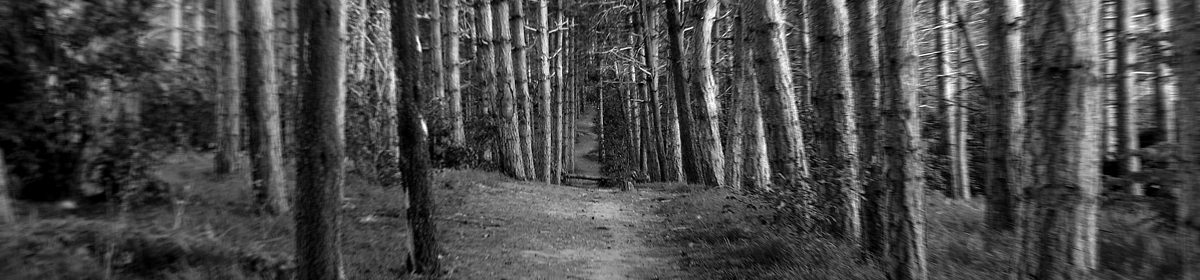
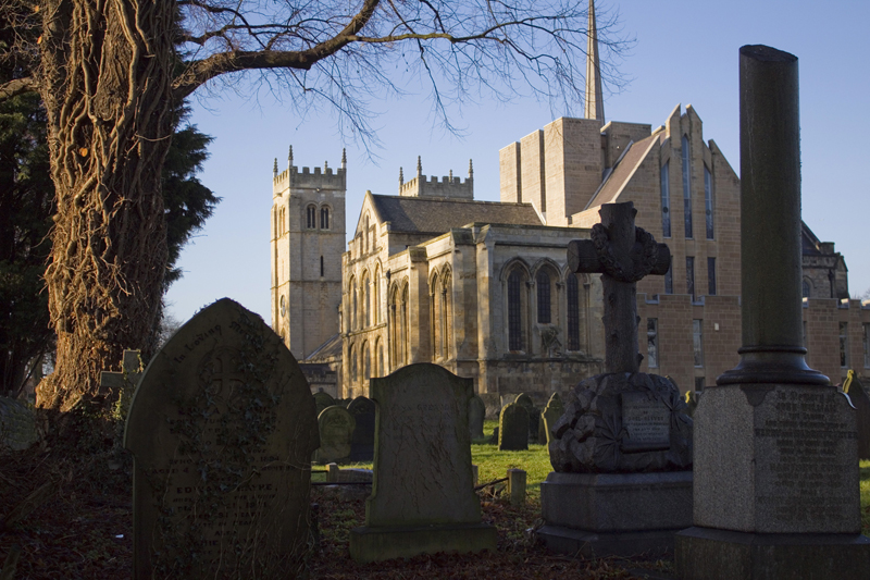
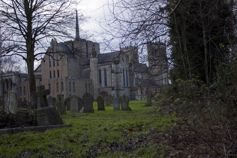
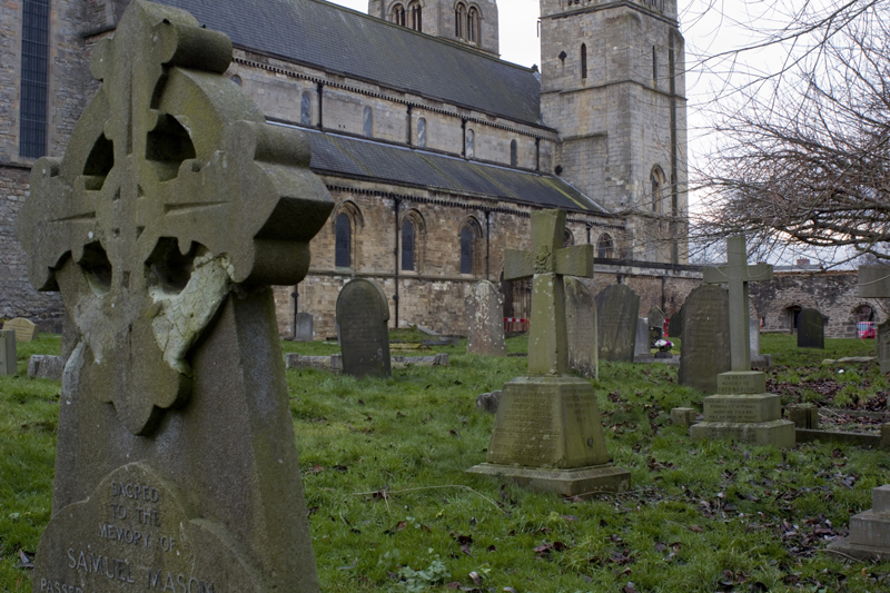
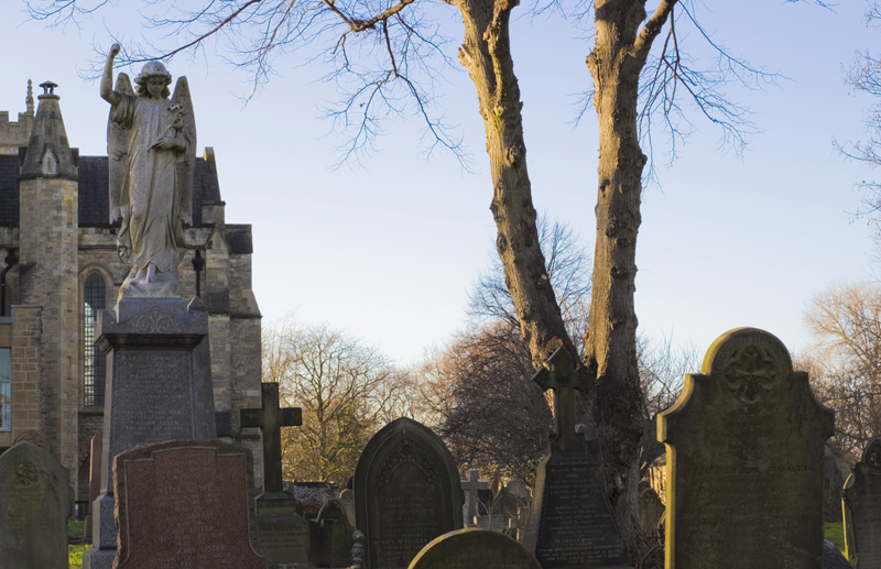
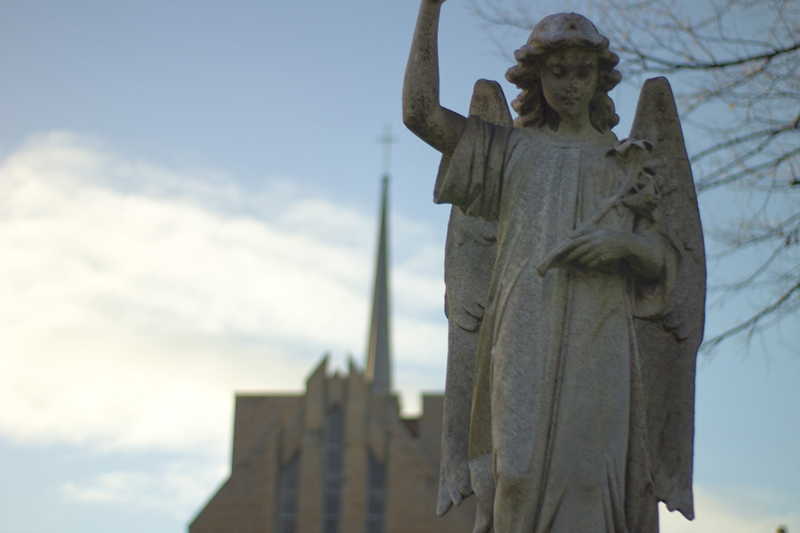
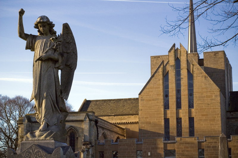
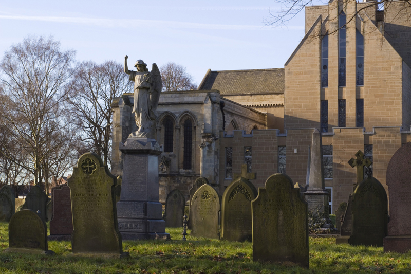
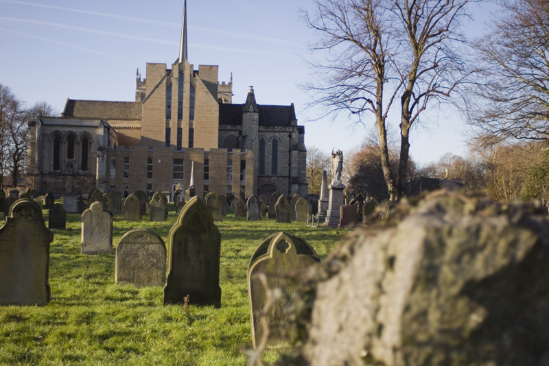
My first shoot was at The Priory Church in Worksop, just down the road from where I live. The building is somewhere between 800 and 900 years old, in parts, and in my opinion, it’s the most interesting feature in what is an otherwise unremarkable town.

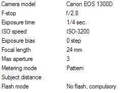
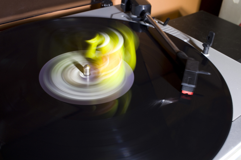
I went along with the kit lense for my Canon EOS 1300D, a fairly standard 18-55mm zoom that’s adequately versatile when you don’t really have a proper plan in mind.

It had been my intention to make just the one visit to this church, take plenty of shots, and then visit different churches on subsequent days.

Nope. That didn’t happen.

On getting home, I looked through the many photos, and was reminded of just what a ‘vanilla’ lens the 18-55 kit lens is. Sure, everything was bright and sharp, but when the widest aperture setting is f3.5, and you only have access to that at 18mm… the results are all very ‘happy snaps’ and not much better than you would expect from a decent phone. I imagine someone with more skill than myself could get interesting results from it, but in this case at least, I failed.

On the plus side, this trip did prove to be useful in terms of reconnaissance, and I got a pretty good idea of what was where… where the good angles and features were.

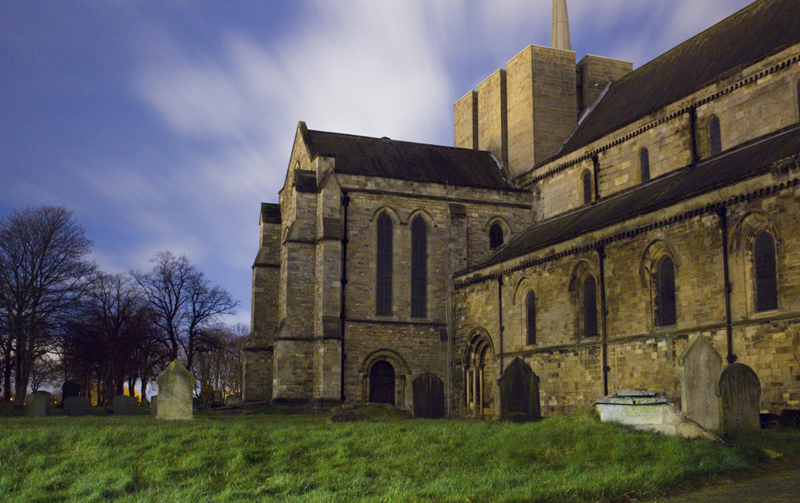
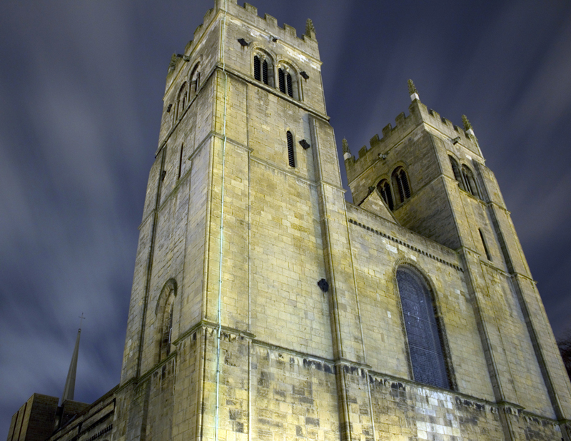
So I returned with a different lens, and got some fascinating shots…. at night. Yup… some really dramatic stuff, but not much that I could use..

Another visit was needed. At this point though, I re-read the brief, and realised (I thought) I hadn’t really been covering the required criteria. “Use the exercises from Part Two as a starting point to test out combinations of focal length, aperture and viewpoint for the set. Decide upon a single format, either vertical or horizontal. You should keep the same combination throughout to lend coherence to the series.” So I began shooting with specific goals in mind. Long/short focal length with deep/shallow depth of field. Near/far in focus… etc.

Now, on looking at that brief again, I had interpreted it as meaning keep the landscape/portrait orientation consistent, while covering all of the bases in terms of focal length, depth of field, etc. to demonstrate the skills that were learned in Part Two of the coursework.

Looking again… it seems that I may have misinterpreted, and not only should I have kept the orientation consistent, but also the focal length/depth of field.

Having said that…. upon reading the work of another student doing this assignment, his tutor reported that using the same settings created a repetitive feeling, and so he used a variety of focal lengths etc.


Anyway… here are some of the images I shortlisted before realising my (probable) error.

#1 

priorychurch_4_800

View 1500 x 1000

With a focal length of 32mm and aperture of F4.5 at ISO 100, this is fairly nondescript in terms of depth of field and angle of view, but I do like the composition and lighting.


#2

priorychurch_8_800

View 1500 x 1000

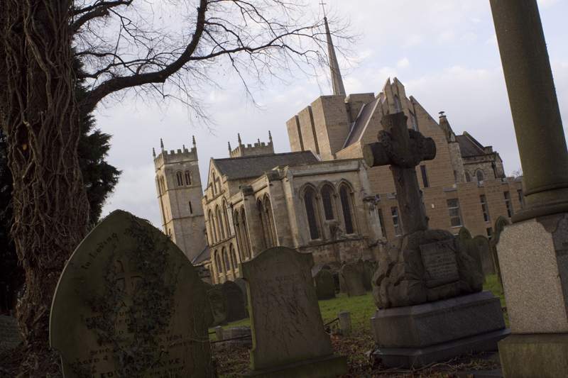
The wide angle produced by the 18mm focal length coupled with an aperture of f4 at ISO 100 creates a pleasing visual sensation. Things are largely in focus until they get up very close, or are right in the back of the shot. To my eyes, it feels quite fluid and easy to look at.


#3

priorychurch2_4_800

View 1500 x 1000

Shot using a fully manual 28mm prime lens, at f2.8 with a 30 second exposure at ISO 100. Though this was only just after dark, it was in fact *much* darker than it appears in this photo. I couldn’t see a thing through either my viewfinder, or on the camera screen, which made framing the shot and focusing very difficult. I had to take several test shots, just to get a clue.


#4

priorychurch2_18a_800

View 1500 x 671

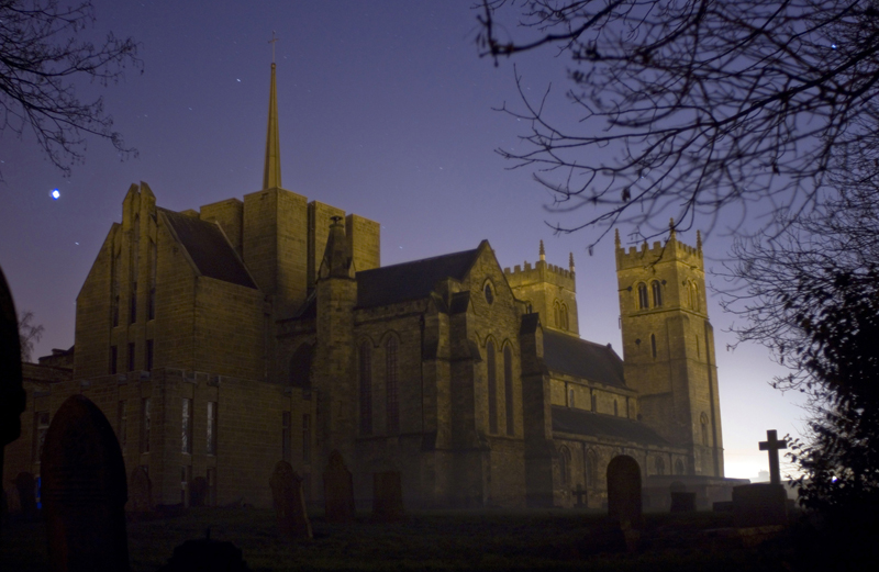
Again, shot shortly after dark using my 28mm prime lense. This lens gives a very soft image when using a wide aperture, so I stopped it down to f16. At ISO 100 this required a 10 minute(!) exposure using bulb mode.

A little context. I was standing in the middle of a large graveyard. It was, without exaggerating, pitch black, to the extent that I could barely see my hand in front of my face. It was cold and it was misty. And there I was, waiting 10 minutes with my finger on the shutter button of the phone app I use to control bulb mode on my camera. (I hadn’t realised at that point that I could take my finger off the button and it would keep going).

So I can’t use this image for the assignment. But So much went into taking it, that I had to show it somewhere, and here will do.


#5

priorychurch2_19_800

View 1500 x 1000

28mm, f2.8, ISO 100, 30 secs. I doubt I can use this, but I love it.


#6

priorychurch3_14_800

View 1500 x 1000

28mm, f2.8, 1/4000 sec, -1 exposure bias.  There are many things wrong with this. It’s underexposed, it’s barely focused anywhere, and it’s completely off kilter. Obviously I can’t use it. But I love it. It reminds me of the kind of photo my dad used to take in the 70s on his SLR (that he didn’t know how to use). All kinds of random things came out of that camera, often by accident, and I loved those shots.


#7

priorychurch3_20_800

View 1500 x 1000

28mm, f2.8, 1/20 sec at ISO 100.  A 2nd go at the first shot, but this manual lense, going for a shallower depth of field and a more ‘interesting’ angle. I liked this a lot, for a while. I find I’ve gone off it now.


#8

priorychurch3_26_800

View 1500 x 1000

28mm, f2.8, 1/250 sec at ISO 100.  I like the rather desolate feeling of this, but the entirely different quality of light means it won’t fit as part of a set.


#9

priorychurch3_45_800

View 1500 x 1000

28mm, f2.8, 1/320 sec at ISO 100. This one speaks volumes to my deranged brain. Ever woken up in a graveyard, propped yourself up, looked around and thought “Huh? That was either one hell of a party last night, or something seriously messed up is going on.”

Again, I can’t use this. The light and the off kilter nature of the shot won’t fit in the set.


#10

priorychurch3_50_800

View 1500 x 1000

28mm, f16, 1/2 sec at ISO 100. Taken for the purpose of demonstrating clarity from the front to the back of the shot when the lens is stopped down. It achieves this aim, but with the poor light, it’s seriously dull.


#11

priorychurch4_2a_800

View 1500 x 1000

23mm, f3.5, 15sec at ISO 200. A 2nd attempt at some night shots. I upped the ISO to 200, as long exposure times generate excessive noise, with the intention of stopping the lens down to f16 again.  I had to take test shots with a wider aperture just to get the focus and this is one of those. Despite appearances, it was *very* dark when I took this. The light on the church is very dim, and being cast from the windows of some nearby offices, while the grass is being lit by the headlights of the occasional passing car.


#12

priorychurch4_8_800

View 1500 x 1000

23mm, f3.5, 40 secs at ISO 200. Dark. Very, very dark. It’s amazing what a long exposure can do, and how images look, especially when you alter the white balance to compensate for artificial lighting.


#13

priorychurch4_11_800

View 1500 x 1000

18mm, f3.5, 30 secs at ISO 200. I still didn’t get round to going down to f16, but the wide angle somehow made things appear sharper here.


#14

priorychurch4_13a_800

View 1500 x 1158

18mm, f3.5, 15 secs at ISO 200. Epic. Can’t use it, but I love it.


#15

priorychurch5_4b_800

View 1500 x 1000

50mm, f16, 1/50 sec at ISO 200. Taken to demonstrate the flattening effect of a closed aperture at long focal lengths. It succeeds in this, and while I like the light, I don’t like the composition as much as I did while I was taking it.


#16

priorychurch5_5_800

View 1500 x 1000

50mm, f1.8, 1/250 sec at ISO 200 with +2 exposure bias and an ND filter. One of the few handheld shots in this series. I couldn’t use a tripod for this, as I had to hold the camera above my head to frame the shot. Taken to demonstrate shallow depth of field with a wide aperture and long focal length.


#17

priorychurch5_33_800

View 1500 x 1000

28mm, f16, 1/30 sec at ISO 200. Taken to demonstrate deep depth of field, even with close objects in the frame,  using a tight aperture on a wide(ish) lens. I like this shot a lot.


#18

priorychurch5_39_800

View 1500 x 1000

28mm, f16, 1/50 sec at ISO 200. Taken for the same purpose as the previous shot. The light is not great, but I do find the way those crosses line up interesting.


#19

priorychurch6_2a_800

View 1500 x 1000

50mm, f16, 1/200 sec at ISO 200 with -1 Exposure bias. Another handheld shot, taken to demonstrate deep depth of field using tight aperture and long focal length. I love the colours and the composition, but am not a fan of having everything in focus like this.


#20

priorychurch6_4_800

View 1500 x 1000

50mm, f16, 1/60 sec at ISO 200 with -1 exposure bias. Same purpose as above. It makes everything so flat.

#21

priorychurch6_8_800

View 1500 x 1000

28mm, f2.8, 1/6000 sec at ISO 200 with -1 exposure bias.  Taken to demonstrate blurring of close objects with a wide aperture. This is my favourite setting, and now I think I’ve figured out what it is I’m supposed to be doing, I intend to go and take some more like this. (I really hope the weather holds).

#22

priorychurch6_13_800

View 1500 x 1000

28mm, f2.8, 1/1250 sec at ISO 200 with -1 exposure bias. Same purpose as above. Not so keen on this.

#23

priorychurch6_14_800

View 1500 x 1000

28mm, f2.8, 1/1000 sec at ISO 200 with -1 exposure bias. Demonstrating close focus with wide aperture and bokeh on background objects. I wanted to show the ice in the stone flowerpot (or whatever it was), but the end result isn’t as interesting as I’d hoped.


Conclusion

So here we are. I’ve taken a mass of photos (these are only a small fraction of what I took), and I’ve concluded that while I have several good shots demonstrating each type of format, I don’t have enough of any one format to create a set.

I may or may not shoot some more to conform to one format, but this depends on the weather, and the forecast is not good. It may be that I shall submit a selection from the shots I have here, and then shoot more, or not, depending on the feedback from my tutor.


Edit:

Okay, on looking at the brief again, I’ve definitely interpreted it incorrectly. So, rather than submitting a set that doesn’t comply with the brief, trying to create a set using inferior material, or going out and shooting in unsuitable light… I have decided to shoot an entirely new set.

This new project is being shot in just a couple of days as opposed to several weeks, and while the subject matter and location are very much within my comfort zone, the style of photography is very far from that. Should be interesting.