Reflection and self-assessment at the end of the ‘Expressing Your Vision’ module

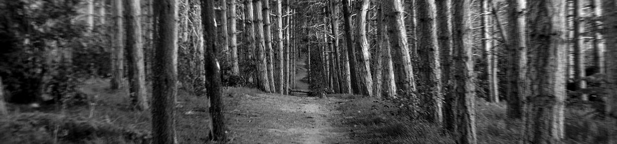
In terms of technical and visual ability, I feel like I have developed well. My confidence with the camera has gown, and I feel I have a better grasp of how to make proper use of aperture settings, shutter speeds, focal lengths, and how to compose my images. I have developed a great enthusiasm for shooting in low light, with both natural and controlled light sources. My attempts at ‘The Decisive Moment’ however, while fun to shoot, are at best, probably rather average.

I feel I have a better grasp of what is recognised as legitimate contemporary art, in the field of photography, having read quite a few books covering the work of many recognised photographers. I am coming to understand how an image that is not at all ‘a beautiful photograph’ can artistically be more important, or relevant, than one that is.

This point, however, is where doubt sets in.

I am aware of the level of complex conceptualisation in much contemporary work, and it is here that I feel my own work falls short.  My images could sometimes fall into the category of pictorialism, if not actually into the vernacular. I have not developed or demonstrated complex concepts in the way that my tutor would like or in the way that I have seen in the work of some of the artists I have studied. This, for me, is a point of internal conflict, and indeed, of conflict with my tutor.

While I accept the validity of many of the stated concepts being depicted by some artists, or written about by some authors, some, I can’t help but reject as pretentious nonsense.  As such, I can’t bring myself to produce a piece of work, and explain it in a way that I think is just … please excuse my language, but I feel this word best describes how I feel about it… ‘bullshit’. The descriptions or explanations given in some cases, quite literally, make me angry, and I won’t be a party to that kind of thing. I need to work hard to find an acceptable middle ground here.

With this in mind, and when feedback from my tutor effectively tells me to start again from scratch, because I haven’t adequately explored an aspect of the concept that was *never* actually part of my concept … I find myself in crisis.

I recognise that the course material is intentionally vague, to allow for maximum flexibility and creativity, and while I find this difficult to get used to, I can deal with it. What I can’t deal with is receiving feedback that appears both contrary to the written goals of the assignment, and gives the impression that the tutor has not actually read my explanation of the concept I am trying to depict, or has simply ignored what I am saying.

It would be safe to say that when it comes to heeding my tutor’s feedback and altering my assignments accordingly, I could be marked as very weak.  In my defence, I can only say that I lost all faith in my tutor. To alter my work, in adherence to advice which seemed unconnected to what I was actually trying to depict, did not strike me as a good way to develop that work.

It seems ridiculous, even outrageous, for me to dismiss the feedback of my tutor, given his position, knowledge, and experience, (I’m prone to arrogance, but I’m not *that* arrogant) but I could only go on the evidence before me, and that suggested that he (more than once) either hadn’t read what I had written, before providing his feedback, or simply wasn’t paying attention to the details.

Suffice to say, I am very unhappy at this point. Having lost faith in the person whose feedback I should most pay attention to, I am now entirely unsure of the quality of my work, and whether I have done well, or otherwise, in completing the assignments.  I can only hope I pass this module, as time constraints demand that I apply for the next two modules, before receiving the results of this one. I am nervous.

Rinko Kawauchi

I’m continuing to explore the works of artists whose photographic work diverges from the norms of conventional photographic technique… the kind of methods taught in this module.

In Project 2, I was struck by the image by Rinko Kawauchi, used on the cover of her Illuminance book https://www.theguardian.com/artanddesign/2011/dec/07/deutsche-borse-prize-photography-2012

While the image may or may not be in focus in some areas, it is overexposed, to the extent that the detail of the main subject is almost entirely lost.

Now, this book was shortlisted for the Deutsche Borse Prize, so while the image may be indeed be overexposed, which is viewed on a photographically technical level as wrong, the work must be taken seriously. So what is going on here?

Rinko Kawauchi is a prolific photographer from Japan, who continues to create a growing number of photobooks, and has had exhibitions around the world.

Her methodology is unusual, in that she doesn’t take multiple shots of a subject, and then select the best one. She tries to capture an individual moment in as perfect and unique a fashion as she can, in one shot.

Her images are glimpse of her own personal perception of the world. They are moments and subjects that may be mundane, but when seen through the right eyes, are beautiful.

‘Rinko Kawauchi explains that her photos are supposed to give you the feeling of looking in on a moment about to happen. This feeling of catching the tail end of a whisper or the beginning of a storm is more important to her than planned composition’ (The Culture Trip, 2016)

Looking at more of her images, there are many that feature lens flare, bloom, aberrant exposure or focus… things that photographers normally try to avoid.

Obviously, all of these aspects are intentional. So what is it that sets these images apart? How is it that they are good art, and not bad photography?

My feeling is that it’s because they all come together as a coherent set. When they’re looked at as a group, you can appreciate the mood, and feeling being represented. You can feel the magic. There’s an ethereal joy that’s quite unique, and yet so obvious.

My first reaction, when seeing that one image, linked to from Project 2, was one of confusion. The image looked like a reject. How could it possibly be considered good photography? Seeing the series though, I’ve come to appreciate it as a beautiful moment… like waking up with bleary eyes, in a strange light, and before you’ve focused… just managing to make out flowers.

Life is not always experienced in a perfect way. Scenes can be spied from weird angles, with incomplete views, and the sun getting in your eyes. Kawauchi’s photography reflects this reality.

Andla, L. (2016) ’10 Things you should know about Rinko Kawauchi.’ In: The Culture Trip [online] At: https://theculturetrip.com/asia/japan/articles/rinko-kawauchi-10-things-you-should-know-about-the-first-lady-of-japanese-photography/ (Accessed on: 23/06/2017)

Jeff Wall

In exploring aspects of art photography and how, sometimes, good art is made by ignoring many of the skills demonstrated by this module, I found myself reading about the Pictorialist movement, from the late 1800s.

This style was based upon paintings from the same era, which often depict everyday scenes, such as a rural idyll, with peasant workers, toiling in the fields.

Two most notable photographers from this field of photography are Henry Peach Robinson, and Henry Peter Emerson. These two, while both conforming to the norms of Pictorialism, were at opposite ends of the spectrum, in terms of methodology.

Robinson used sharp focus, from the foreground to background, in posed scenes, often using multiple exposures which were composited in the darkroom, to achieve lighting effects that would be impossible with one exposure. In modern terms, this was very similar to using high dynamic range in photo editing software.

Emerson, on the other hand, used a shallow depth of field, photographing actual workers in the fields, to achieve a more natural looks.

The final goal for both, however, was the same: To create a visually pleasing image. It may or may not have represented the real world. It may or may not have contained some social commentary. But it had to be beautiful, and draw the viewer into the scene, so they imagine themselves experiencing it in the first person.


This initial Pictorial movement largely faded by the 1910s, but a less formalised trend of modern Pictorialism took root in the 1970s, to become very popular by the ‘90s.

A major player in this movement, and the subject of my interest at this time, is Jeff Wall.

At first glance, I found it difficult to grasp how Wall’s images conformed to any Pictorialist norms, being neither rural, nor beautiful. This was missing the point, however. His images depict people in modern environments, living out modern situations.

These images are not as they seem, however. At a glance, they appear to be snapshots of everyday life. Random events in random locations. The reality is rather different.

They are in fact re-creations, of events seen by Wall, but not actually photographed at the time. “To not photograph,” he says, “gives a certain freedom to then re-create or reshape what I saw.”  (Wall, cited in O’Hagan, 2015)

They are meticulously staged, though to what extend any of the scene is real, or whether the people depicted are actors, or people from the original scene, is unclear.

When compared with those original Pictorialists from the 19th century, Wall appears to fall more into the Robinson camp, with his artificial manipulation of the scene, where the final composition of the scene is given priority over capturing actual reality. It is a fake reality, where, for Robinson, it happened only in his mind’s eye, while for Wall, he observed it with his actual eyes, and then re-created it.


So, having been tasked by my tutor to explore works that, at a glance, appear not to adhere to the methods that we would consider good photography; the methods taught in this module on composition, focus, lighting, etc. these images by Wall would seem to fall into that category, in regard to composition. Their appearance, seeming to be snapshots, capturing a moment in time, even mimicking hastily captured ‘decisive moments’ belie the time and effort that has gone into making them.

This being the case… the deception… the lie, if you will… is what makes them art. They look like a hasty snapshot, but they aren’t. Some of them, while appearing quite random, mimic impressionist paintings: ‘The Storyteller’ …

…paying homage to Claude Monet’s ‘Railway Bridge, Argenteuil’…

It does, though, seem to me, that to truly appreciate this kind of art, it is necessary to have knowledge of art and art history. It seems without being familiar with certain paintings, or types of painting, looking at these images can only elicit a “what’s that all about?” or “I could do better than that”. It seems to exclude the casual viewer from appreciating the full depth and meaning of the image.

This seems to be an aspect of art in general, and not specific to art photography, but it is something I find myself not entirely comfortable with.


Reference:

O’Hagan, S. ‘Jeff Wall: ‘I’m haunted by the idea that my photography was all a big mistake.’’ In: The Guardian 03/11/2015 AT https://www.theguardian.com/artanddesign/2015/nov/03/jeff-wall-photography-marian-goodman-gallery-show [Accessed: 20/06/2017]

Context

Just a quick note to myself, on some important points I picked up while reading Terry Barrett’s essay ‘Photographs and Context’ http://www.terrybarrettosu.com/pdfs/B_PhotAndCont_97.pdf  (Accessed 16/05/2017)

The apparent meaning of a photograph can vary, depending on context.

The format the photograph is presented in, such as the type of magazine, book, or location, such as a gallery or museum, are factors. Text that is reproduced with an image, be it a caption, essay, or editorial all affect how an image is perceived. The same image can be made to take on entirely the opposite meaning, depending on the context it is presented in.

Images can be reused in different ways, so something intended to shock or create sympathy… or something created purely as visual evidence, can all have their meanings completely altered, by presenting them in a different context, such as an art gallery.

This can diminish their original purpose, so that a photo intended to convey the suffering of poverty, reduces it to an aesthetically impressive image on a coffee table.

There is also the effect of altering the important or relevant aspect of a photo away from what the image is of, and onto who made the image. This can be a positive, in bringing talented photographers to the attention of the viewing world. It can, though, also be a negative, in that photographs of important events become listed under the name of the photographer, and as such, may not be seen by those looking for the subject matter itself.


Things to consider when interpreting a photograph:

Internal Context – Title, date and photographer.

External Context – Where and how the photograph is presented.

Original Context – What is actually in the photograph itself.


Remember that a photograph was taken with an intention. The viewer is not simply looking at an image of the world as it is… or was. It is being viewed as the photographer chose to present it, and to correctly interpret an image, it is necessary to consider the intention of the photographer.

Photographs can present ‘a’ truth of what a scene looked like at a given time, but they can also lie, (or rather, be used to lie) about what was actually happening.


Gregory Crewdson

Gregory Crewdson is, to my mind, an unusual photographer. In one sense, he is not actually a photographer at all. “I do have an unusual relationship to photography. I don’t even like to hold a camera. I don’t take the actual picture.” Crewdson (2007)

Crewdson is a photographic artist whose method involves using a large crew of  up to sixty cinematically trained technicians, to create complex staged images, with production values that are comparable to those used in cinema.

All elements of the image are controlled, from the staging, lighting, models, costume etc.

The images he creates can be unsettling, or strange. Though set in fairly typical middle class areas, where nothing out of the ordinary would be expected, the scenes Crewdson creates are filled with tension and mystery. Something strange is going on… there’s a story here…. pieces to put together… but unlike a film, everything is told in that one frame.

I was initially sceptical about Crewdson’s methods, and indeed, the legitimacy of his work as photography, but the more I see of it, and the more I work on my own images, the more I come to appreciate what can be achieved by such detailed control of all aspects of a scene.

While my own recent work on assignment 4, ‘The Language of Light’. is in no way comparable to Crewdson’s work, I have found that I’m able to create more visually striking images by manipulating the objects and lighting of the given scene, than by simply photographing the scene as I find it.


Crewdson. G (2007) The Genius of Photography Episode 6 – Snap Judgements [DVD]BBC

Hendrik Kerstens

At my tutor’s suggestion, I am looking at the work of Hendrik Kerstens, with a focus on his creation of a coherent series of images.

I can see immediately why my tutor suggested I look at his work, as the images of Kerstens’ daughter, emulating the works of great Dutch masters have a unique and coherent style and feel.

The orientation of the frame, the plain (often black) background forces the viewer to concentrate the entirety of their attention on the model. Lighting and facial expression are consistent throughout.

On a purely logical level, I see the value of these images as an example of a way to create a coherent set. If a photographer takes multiple images of a single subject in the same setting, with consistent lighting, altering only the clothing and perhaps the posture… they are guaranteed to hang together as a set.

The difficulty arises when taking images from different angles, perhaps from different locations, in differing weather or lighting conditions.  This is not intended to in any way denigrate Kerstens’ work… merely to observe that when working outside of a fixed setting, it’s value as an example is limited.


Thomas Ruff – Portraits

Again, suggested by my tutor as an example of a collection of images that create a cohesive series.

Ruff’s portraits, at first glance, strike me as like looking at passport photographs. They are stark, expressionless, facing directly towards the camera, with plain backgrounds. With this in mind, it didn’t surprise me to learn that Ruff had studied with Bernd and Hilla Becher, famous for their stark industrial typologies.

Printed out in very large format, I can imagine how, with the lack of any displayed personal character, or visual context, the viewer would be forced to examine the details and colours present in the image.

That all of the images adhere strictly to this format, a typology of faces, if you like, you are left in no doubt that you are looking at a coherent collection, and not simply a group of random photos of faces.

I do feel that the size of these images is important, and is what differentiates the series from merely a bunch of pretend passport photos. At passport image size, you wouldn’t give them a second glance. In a very large format, they have impact, and demand you look at them.

This makes me ponder quite where the art is. Is it in the forcing of the viewer to look at the details of the ‘object’ in the image…. as  an attempt has been made to remove any aspect of ‘person’? Or is it in the taking of an unremarkable image, and making it very large?

This reminds of of the experience of attending live music venues. I have listened to some unremarkable bands whose recorded albums are, at best, mediocre, but when performed live, over an impressive sound system, create an energy that is exciting.

So am I excited by the band…. or the volume?

Same thing here?

Cindy Sherman – Untitled Film Stills

In feedback from my tutor: “Look at Sherman’s Untitled Film Stills project and think about how coherent the series is and how each image adds more to the series.”


I’ve been coming across Cindy Sherman’s work quite a lot recently, in various books I’ve been reading, and documentary series’ I’ve been watching, and have grown to appreciate her work a good deal more than the first time I saw it.

I like her attitude, which strikes me as unpretentious.  Referring to her early work, she said ‘I don’t theorize when I work. I would read theoretical stuff about my work and think, “What? Where did they get that?” The work was so intuitive for me, I didn’t know where it was coming from.’ (Sherman, cited in Bright, 2005:25)

Looking at the Untitled Film Stills series itself, there are some obvious consistencies that help the images hang together as a single body of work.

While the image dimensions may not always be exactly the same, the general format is consistent… landscape orientation, mimicking a still from a movie. They are (almost) all in black and white, with a very specific quality, like that of old B movies from the 50s. While the grey tones may not be exactly the same each time, that is logical, as not all movies would have the same tones… just as they would have varying qualities of film grain.  The inconsistencies are consistent.

A thing that is most striking, as a consistent feature, is Sherman herself. Apart from the obvious fact that she features in all of the images,  it’s her ‘performance’ that works so well. She is playing different characters, and so appears different each time, but there are these inscrutable facial expressions… you know there is something happening, something that is provoking a reaction, but you can’t quite work out what it is.

So while the locations may be different, the depicted characters are different, and the stories are different, you always know you’re looking at a moment in time, within a certain type of story, set in a certain era, with a certain mood.  You never know the specifics, but you know what kind of world Sherman is showing you.


Reference

Bright, S. (2005) Art Photography Now. London: Thames and Hudson

Reflection following Exercise 4.4

I have no special studio equipment or lights, and so was using what I had to hand. (I have ordered some cheap gear from a chinese company who I do a little promotional work for, but it hasn’t arrived yet). As such, my light sources were weak and unable to cast significant light from any distance. This being the case, I was unable to see the effect, on shadows, of moving the lamps further away.

Nevertheless, I was able to see how the positioning and use of multiple light sources has a dramatic effect on the look of an object.

I have concluded that a light source directly in front of the object doesn’t look good at all, while having the light from one side balance out the light from the opposite side doesn’t look much better.

Two light sources, one stronger than the other, from different angles, seems to produce the most interesting images. In this way, it’s possible to create a sense of balanced depth. There are shadows, but they aren’t overstated.

My attempt to alter the colour of the light was largely ineffectual, but it did alter the atmosphere very slightly.  I’m sure proper colour gels on proper studio lighting could be very useful.

Reflection following Exercise 4.3

Compared with Exercise 4.2, I found working with artificial light more predictable and enjoyable. While it can be limiting, in terms of subject matter…. you can’t go and shoot landscapes in artificial light…  I like the predictability (and sometimes, controllability).

While it would have been nice to go out and shoot dramatic atmospheric images like Dan Holdsworth, the necessary atmospheric conditions just weren’t there, so I found myself interested in much smaller details and subjects.

Multiple light sources of different qualities make for very interesting images, though I also found these the hardest to shoot, while for reasons that I don’t understand, highly coloured light causes some software problems.

While the subject matter and general feel of these images is varied, I do find there’s one thing that’s common to all of them. They have a sense of stillness. In some it might be odd, with a certain tension… but all are calm and quiet. I like that a lot.